No-Code Website Page Builders Are the Future

No-Code Website Page Builders Are the Future

Table of Contents

  1. Introduction to Branding and Adobe Illustrator
  2. Crafting a Unique Logo with Adobe Illustrator
  3. Developing a Comprehensive Brand Guide
  4. Designing Your Website with Adobe Illustrator
  5. Maintaining Consistency Across Digital Platforms
  6. Frequently Asked Questions

No-Code Website Page Builders: Paving the Way to the Future


Introduction

Website design is an ever-evolving discipline, driven by technological innovations and changing user demands. With the rise of no-code website page builders, we’re witnessing a paradigm shift in the way websites are conceptualized, designed, and launched. But is this shift just a fleeting trend, or is it a sign of the inevitable future? Dive in with us as we delve into the compelling world of no-code solutions and their transformative impact on website design.

What are No-Code Website Builders?

No-code website builders are platforms that allow users to create fully functional websites without having to write any code. They often come with drag-and-drop functionalities, pre-designed templates, and a range of customizable features. The goal? To democratize the web design process, enabling everyone—from business owners to freelancers—to establish an online presence without the need for technical expertise.

In essence, these tools are about breaking barriers. Gone are the days where building a website required a deep understanding of HTML, CSS, or JavaScript. Today, with platforms like these, anyone can create a professional-looking website in a fraction of the time it once took.

Why No-Code is Changing the Game

1. Accessibility for All

As mentioned, one of the biggest advantages of no-code platforms is accessibility. Small business owners, hobbyists, and even large corporations are turning to these platforms for a hassle-free way to build and maintain their websites. They’re especially beneficial for startups and entrepreneurs who might not have the budget to hire a full-fledged web developer but still want a sleek, responsive website to represent their brand.

2. Cost-Effective Solutions

Hiring a team of developers and designers can be costly, both in terms of time and money. No-code solutions, on the other hand, provide an affordable alternative, allowing businesses to allocate resources elsewhere. According to an insightful article on dev.to, not only do these tools reduce development time, but they also eliminate the need for regular updates and maintenance, leading to significant long-term savings.

3. Flexibility and Creativity

The beauty of no-code platforms is the freedom they offer. With an array of templates and customizable features, users can easily tweak designs to fit their unique brand identity. Contrary to the misconception that these platforms might stifle creativity due to template-based designs, many have found that the opposite is true. As pointed out by Designmodo, these tools often act as a starting point, enabling users to explore and experiment without the fear of breaking anything.

4. Speed and Efficiency

In a fast-paced digital world, speed is of the essence. No-code solutions ensure that websites can be up and running in record time. Businesses can swiftly respond to market changes, launch new products, or announce events without waiting weeks or months for website development.

The Role of Traditional Web Design

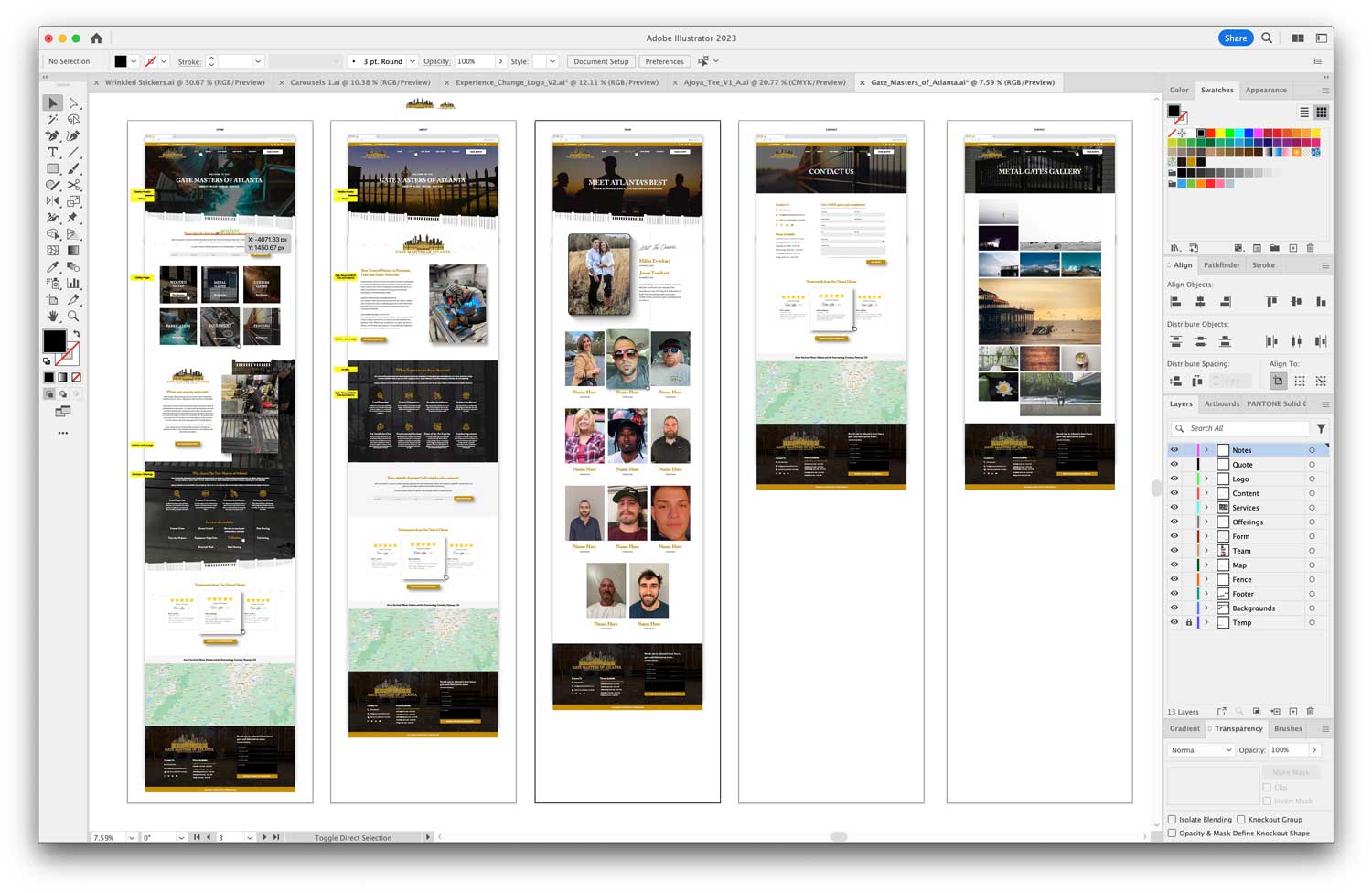
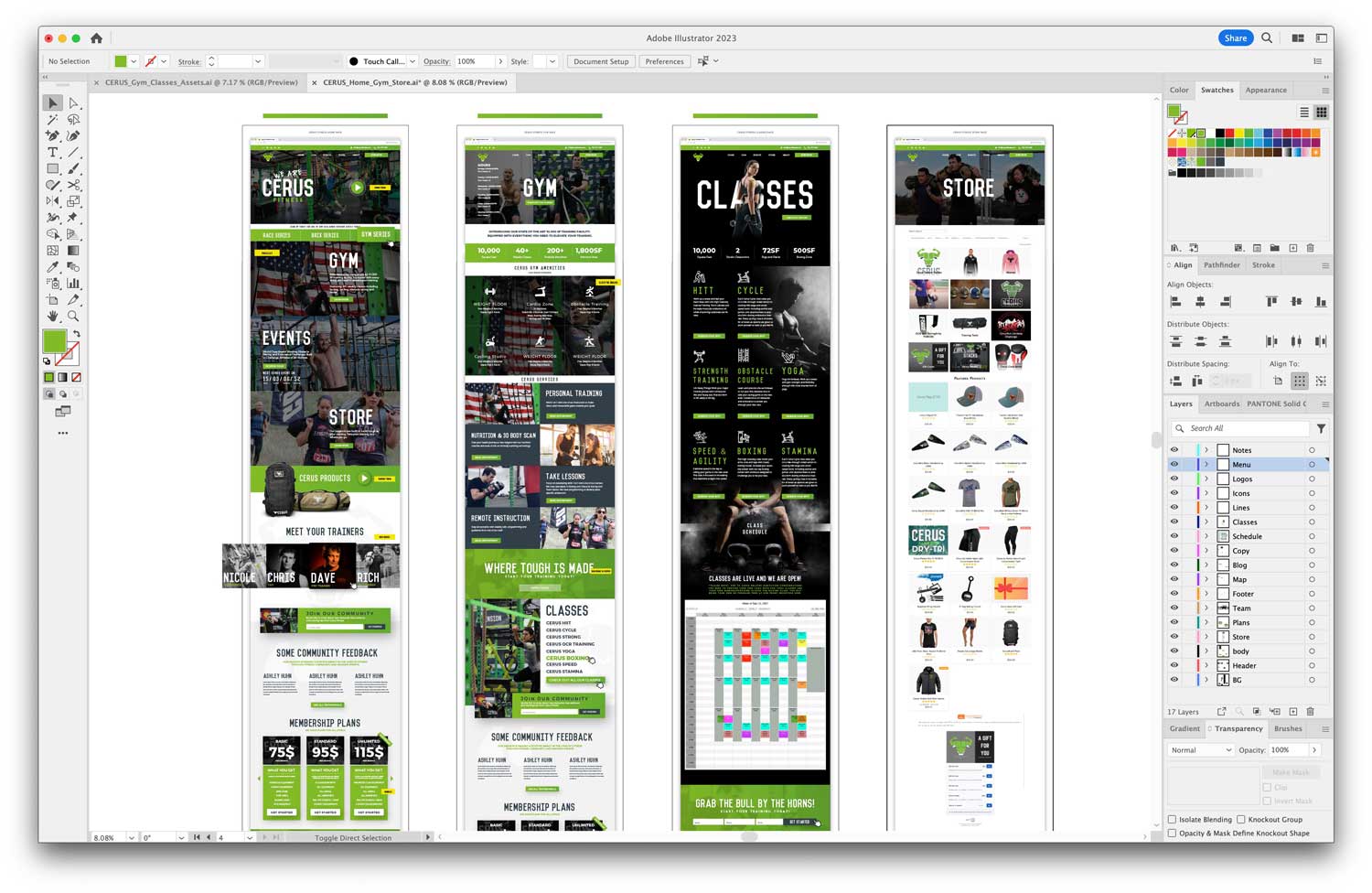
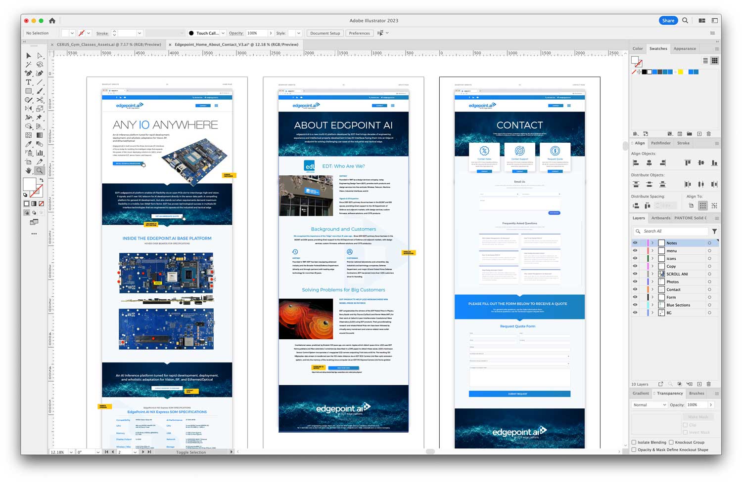
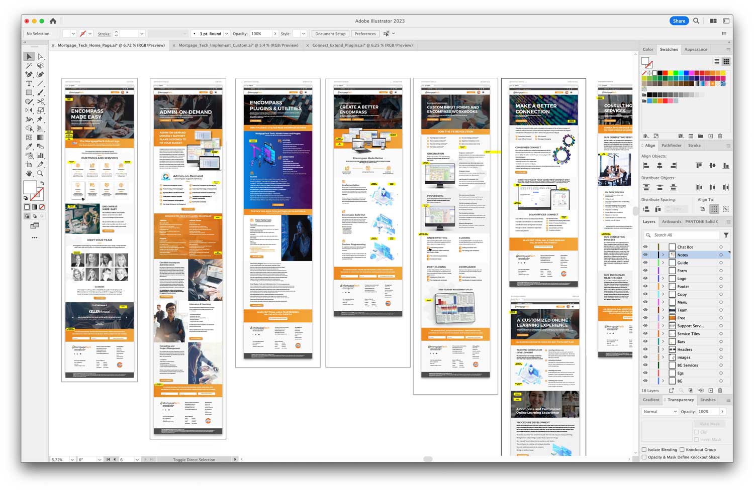
While no-code platforms are undoubtedly on the rise, traditional web design methods still hold their ground. Tools like Adobe Illustrator remain popular among designers for crafting intricate website layouts and mockups. In fact, the future might see a blend of both worlds. A guide on designing a website in Adobe Illustrator suggests that designers can conceptualize their vision using tools they’re familiar with and then bring it to life through no-code platforms. This approach ensures that creativity is never compromised while enjoying the benefits of speedy no-code development.

Conclusion: A Future Embracing No-Code

It’s clear that no-code website page builders are not just a passing phase; they’re here to redefine the way we perceive web design. By striking a balance between creativity and functionality, these platforms are setting the tone for a future where anyone can be a web designer. As businesses recognize the importance of a robust online presence, the allure of no-code solutions will only grow stronger.

Stay tuned as we dive deeper into the intricacies of no-code platforms in the next sections, shedding light on their advanced features, potential drawbacks, and how they compare against other web-building solutions.

Harnessing the Power of No-Code: Advanced Features and Beyond


Delving Deeper into No-Code Capabilities

As we transition further into the digital age, it’s not just about having a website—it’s about having a dynamic, interactive, and adaptive online space. No-code platforms aren’t just about basic drag-and-drop functionalities; they have evolved to offer a plethora of advanced features that cater to diverse needs.

1. Integrations and Plugins

Modern no-code website builders are all about integrations. Whether it’s incorporating e-commerce solutions, embedding videos, or integrating with third-party apps like email marketing platforms and CRM systems, no-code platforms are ensuring that businesses have all the tools they need at their fingertips. This seamless integration ensures that websites are not just static digital brochures but dynamic hubs of interaction.

2. Responsiveness and Mobile Optimization

In a world where a significant portion of web traffic comes from mobile devices, having a mobile-optimized website is no longer an option—it’s a necessity. No-code platforms have made it incredibly easy to ensure websites are responsive. With real-time previews and adaptable layouts, these platforms guarantee a consistent user experience across all devices.

3. Advanced SEO Tools

Search engine optimization (SEO) is vital for ensuring visibility in an increasingly crowded digital space. Leading no-code website builders recognize this and offer advanced SEO tools that allow users to tweak meta tags, craft SEO-friendly URLs, and even integrate analytical tools to monitor web traffic and user behavior.

4. AI-Powered Design Assistance

Some no-code platforms are now leveraging artificial intelligence to aid the design process. These AI assistants can provide suggestions, optimize layouts for better user experience, and even create designs based on user input. This is a game-changer, especially for those who may feel overwhelmed by the plethora of design choices available.

Potential Challenges and Drawbacks

While no-code platforms are revolutionizing the web design realm, they are not without their challenges. It’s essential to approach them with a balanced perspective.

1. Limitations in Customization

Even with the vast array of templates and features, there might be specific customization limitations when compared to a website coded from scratch. For some businesses with highly specialized needs, this could pose a challenge.

2. Learning Curve

Though designed to be user-friendly, there can still be a learning curve associated with mastering all the features of a no-code platform, especially the advanced ones. Users might need to invest time in tutorials and guides to make the most of the platform.

3. Data Security and Control

Hosting on no-code platforms often means the data resides on third-party servers. For businesses that deal with sensitive information, there might be concerns regarding data security, privacy, and compliance with regulations.

4. Scalability Concerns

While no-code solutions are excellent for startups and medium-sized businesses, there could be concerns about scalability and performance as the business grows and attracts more web traffic.

Striking the Right Balance: No-Code and Traditional Web Design

While no-code is undoubtedly a powerful tool, it’s essential to understand its place in the broader ecosystem of web design. As pointed out by experts at Designmodo, no-code doesn’t necessarily spell the end for traditional web design. Instead, it offers an alternative route, especially for those who need quick solutions without deep technical involvement.

Traditional web design, with its emphasis on custom solutions, detailed coding, and intricate designs (like those created using tools like Adobe Illustrator), still holds immense value. It’s about selecting the right tool for the job.

Conclusion: Embracing the Best of Both Worlds

No-code platforms offer an exciting avenue for rapid, cost-effective, and dynamic web design. However, like any tool, they come with their strengths and limitations. The future of web design likely lies in a harmonious blend of no-code solutions and traditional web design methodologies.

In the next and final section, we’ll explore how businesses and individuals can best leverage these tools for their specific needs and how the landscape of web design might evolve in the coming years.

Envisioning the Future: Integrating No-Code into the Web Design Tapestry


Setting the Stage for Tomorrow

In our exploration of no-code platforms, we’ve seen their transformative power and potential challenges. As we stand at the cusp of a new era in web design, it’s crucial to understand how these platforms will fit into the broader landscape and how businesses can optimize their online strategies.

1. Personalization and User Experience

One undeniable trend is the growing emphasis on personalization. As no-code platforms integrate AI and machine learning, we can expect websites that automatically adapt to user preferences, behaviors, and browsing patterns. This level of personalization will lead to more engaging user experiences and higher conversion rates.

2. Collaboration and Community Building

No-code platforms aren’t just tools for individual creators. They’re also fostering collaborative environments where teams can work together seamlessly. In the future, we might see these platforms evolve into hubs where businesses, designers, marketers, and other stakeholders collaborate in real-time, fostering a sense of community and shared vision.

3. Continuous Evolution and Learning

As with any technology, stagnation is not an option. The best no-code platforms will be those that continuously evolve, integrate new features, and respond to user feedback. This dynamic nature ensures that businesses can always access the latest tools and stay ahead of the curve.

Adapting to the No-Code Era: Tips for Businesses

With the rising influence of no-code solutions, businesses need to adapt to make the most of these tools. Here are some strategic steps to consider:

1. Understand Your Needs

Before diving into any platform, it’s vital to understand your business needs. Is speed and efficiency your primary concern? Or are you looking for intricate customization and scalability? Answering these questions will help you select the right tool for your goals.

2. Invest in Learning

While no-code platforms are designed to be intuitive, there’s always value in investing time to learn their nuances. Consider taking online courses, attending workshops, or engaging with the platform’s community to master its features.

3. Blend and Optimize

Remember, no-code is just one tool in the toolbox. For a comprehensive web strategy, consider blending no-code solutions with traditional web design. Tools like Adobe Illustrator offer unparalleled design capabilities that can be integrated into no-code platforms for a holistic approach.

4. Monitor and Iterate

The digital landscape is always changing. It’s crucial to monitor your website’s performance, gather feedback, and be ready to iterate. This continuous improvement mindset ensures that your online presence remains relevant and effective.

Conclusion: A Bright Horizon for Web Design

The rise of no-code platforms signals an exciting time for web design. By democratizing the creation process, these tools are empowering more people to bring their visions to life online. But, as with all technological advancements, the key lies in understanding their potential, their limitations, and how they fit into the broader web design narrative.

As we look to the future, one thing is clear: the world of web design will be richer, more inclusive, and more dynamic than ever before. Whether you’re a seasoned developer, a budding entrepreneur, or someone just looking to share their passion online, there’s a place for you in this vibrant tapestry. And with tools like no-code platforms at our disposal, the sky’s the limit.

How to Design a Website in Adobe Illustrator in 2024

How to Design a Website in Adobe Illustrator in 2024

Table of Contents

Section 1: Introduction to Web Design with Adobe Illustrator

  1. Introduction: The Evolution of Web Design with Adobe Illustrator
  2. The Power of Digital: Elevating the Brand Experience in 2023
  3. Setting the Stage: Preparing Your Illustrator Workspace
  4. Why Web Design Matters:** Building Trust and Authenticity
  5. Embracing Change: Web Design Trends for 2024
  6. The Illustrator Advantage: Vector vs. Bitmap Graphics
  7. Collaboration: Working with Web Design Agencies

Section 2: Navigating the Design Process

  1. Kickstarting the Design: Using artboards for Layouts
  2. Fluid Designs: Crafting Responsive Web Layouts
  3. Asset Management: Harnessing Illustrator’s Libraries
  4. Creativity Unleashed: Utilizing Illustrator’s Vector Tools
  5. Branding: Synchronized Color Themes and Typography
  6. Boosting Efficiency: Top Illustrator Plugins in 2024
  7. From Design to Development: Exporting Web-Ready Assets

Section 3: Perfecting and Publishing Your Design

  1. Design Evaluation: Testing Across Devices and Browsers
  2. Iteration: Importance of User Feedback in Design Refinement
  3. Integration: Merging Illustrator Designs with Web Platforms
  4. The Final Touch: Enhancements and Add-ons for Your Website
  5. Going Live: Launch Checklist for Your Illustrator-Designed Website
  6. Looking Ahead: Maintaining and Updating Your Design
  7. Conclusion: The Future of Web Design with Adobe Illustrator

SECTION 1: The Evolution of Web Design

The digital age has rapidly evolved, and with it, the world of web design. From simple text-based web pages to today’s immersive, interactive experiences, the transformation is nothing short of remarkable. And a crucial tool driving this evolution is Adobe Illustrator, a software that has remained a favorite for designers worldwide. As we step into 2024, let’s delve into how to harness the power of Adobe Illustrator for your website designs.

Why Adobe Illustrator?

Adobe Illustrator offers vector-based graphics which means your designs remain crisp and scalable, regardless of the screen size. This is a must in today’s diverse device ecosystem. Moreover, with the ever-growing importance of a new business website, Adobe Illustrator ensures your designs aren’t just beautiful but also functional.

Setting the Foundation

Before jumping into the design, always start by understanding the objective of the website. Are you trying to elevate a brand experience like many premium branding solutions out there? Or perhaps provide a streamlined user experience? Know your goal, and let it guide your design.

Starting Your Design Journey in Adobe Illustrator

Setting Up Your Canvas

  1. Open Adobe Illustrator: Launch the program and create a new document.
  2. Select Web Preset: Choose the ‘Web’ preset. This will automatically set your workspace dimensions optimized for web design.
  3. Adjust Artboard: Customize the artboard size based on your specific needs. Remember, responsive design is key.

Designing the Layout

With your canvas ready, now comes the fun part – designing!

  1. Use Grids: Grids help maintain consistency and alignment. You can easily set them up by going to ‘View’ > ‘Show Grid’.
  2. Wireframe: Sketch out a rough layout. This helps visualize the user flow and site structure.
  3. Play with Colors: Ensure the colors resonate with the brand’s message. Using color guides in Illustrator can be immensely helpful.
  4. Typography Matters: Choose fonts that are web-safe and readable. Adobe Illustrator offers a plethora of typeface options to pick from.

Elements that Make Your Design Stand Out

Icons and Graphics

A picture speaks a thousand words. Design or choose relevant icons that add value to the content. Illustrator’s vector-based design ensures these graphics are sharp and versatile.

Interactive Elements

Interactive buttons, drop downs, and sliders can elevate a user’s experience. While Illustrator is primarily a design tool, you can visualize how these elements would function in the final site. Working closely with a web design and development agency can help turn these visions into reality.

Exporting and Integration

Once you’re satisfied with the design, it’s time to export. Illustrator offers multiple export options optimized for web. Ensure you collaborate with your developer for smooth integration.

In the upcoming sections, we’ll delve deeper into advanced Illustrator techniques, ensuring your website not only looks good but also performs seamlessly.

SECTION 2: Advanced Techniques in Adobe Illustrator for Web Design

Embracing the Power of Layers

Working with layers in Adobe Illustrator can significantly streamline your design process. Layers allow you to separate different elements, making it easier to edit and organize your design.

Benefits of Using Layers

  1. Isolation: Easily isolate and work on specific parts of your design without affecting other elements.
  2. Organization: Group related items together, making the design process more systematic and efficient.
  3. Flexibility: Toggle visibility, lock specific layers, and adjust opacity to achieve the desired effect.

Harnessing Illustrator’s Plugins and Extensions

The beauty of Illustrator lies in its extensibility. Various plugins and extensions are available that can enhance your web design capabilities.

Must-Have Plugins for Web Designers

  1. VectorScribe: This tool enhances your vector designing capability, allowing for more intricate details.
  2. MagicPicker: An advanced color wheel plugin to refine your color selection process, ensuring brand consistency.
  3. InkScribe: Streamlines the drawing process, perfect for creating intricate icons and graphics.

Tips for a Responsive Design in Illustrator

In 2024, responsiveness isn’t just a trend; it’s a necessity. With a myriad of devices available, your design must look impeccable on all screen sizes.

Creating Adaptive Designs

  1. Use Symbols: Any changes made to a symbol are automatically updated everywhere it’s used. This is perfect for elements like logos or icons that repeat across web pages.
  2. Artboard Tool: Utilize the Artboard tool to visualize your design on various screen sizes, ensuring consistency and adaptability.
  3. Linking Assets: Illustrator allows you to link assets from Adobe’s Creative Cloud. This ensures that you always use the latest versions of logos, icons, and other assets.

Collaborating with Developers

Designing in Illustrator is just one part of the web development process. Close collaboration with developers is crucial to bring your design to life.

Handing Off Designs

  1. Export as SVG: For web, SVG format ensures scalability without loss of quality.
  2. Use Adobe’s XD: Adobe XD can be used in tandem with Illustrator for prototyping and to ensure a smoother handoff to developers.
  3. Detailed Documentation: Always provide developers with a detailed document outlining fonts, colors, and other design specifics. This reduces ambiguity and ensures fidelity to the original design.

In the next section, we will dive into the final touches, ensuring that your design is not only functional but also aligns with the latest web design trends and standards of 2024.

SECTION 3: Finalizing and Launching Your Web Design

Testing and Iteration

Once your design is complete, testing is an essential step. This ensures that your design not only looks great but also provides an optimal user experience.

Testing Across Different Devices

In the digital age, users access websites from a plethora of devices – from smartphones to large desktop monitors. It’s crucial to ensure consistent design and functionality across all platforms.

  1. Desktop Testing: Review the design on different screen resolutions and browsers.
  2. Mobile Testing: Check the responsiveness on tablets and smartphones, ensuring touch-friendly navigation.
  3. Cross-Browser Compatibility: Make sure your design is consistent and functional across browsers like Chrome, Firefox, Safari, and Edge.

User Feedback and Iteration

A design might look perfect to you, but it’s the end-users whose opinions matter most. Gathering feedback can reveal areas for improvement.

Methods of Gathering Feedback

  1. Surveys: Tools like Google Forms or SurveyMonkey can help gather structured feedback.
  2. User Testing Sessions: Watching real users interact with your design can provide invaluable insights.
  3. Analytics: Tools like Google Analytics can offer data on user behavior, helping pinpoint potential design issues.

Integrating SEO Best Practices

Having a beautifully designed website is just one piece of the puzzle. It also needs to be found. Integrating SEO best practices can significantly boost your site’s visibility.

Essential SEO Integration Steps

  1. Keyword Research: Using tools like AlsoAsked can provide insights into what potential visitors are looking for.
  2. Optimized Metadata: Ensure your title tags, meta descriptions, and headers are optimized for relevant keywords.
  3. Image Optimization: All images should have descriptive alt tags and be compressed without losing quality.

Launching Your Website

The culmination of your hard work is the launch. But, it’s not just about making your website live. It’s about ensuring a smooth transition and monitoring post-launch.

Launch Checklist

  1. Backup: Before making any changes, ensure you have a full backup of your website.
  2. Domain and Hosting: Ensure your domain is correctly pointed to your hosting provider.
  3. Monitor Traffic: After launch, monitor website traffic and user behavior to ensure everything is running smoothly.

In conclusion, designing a website in Adobe Illustrator requires a systematic approach, from the initial stages of design to the final launch. By following these steps, you can ensure a website that’s not only aesthetically pleasing but also user-friendly and search engine optimized.


🌐 Sources

  1. alsoasked.com – AlsoAsked: People Also Ask keyword research tool
  2. apus.libanswers.com – How can I pick the best keywords to use when researching my …
The Importance of a New Business Website

The Importance of a New Business Website

Table of Contents

  1. Section 1: Introduction to the Importance of a New Business Website
    • The Digital Frontier
    • Why You Need a New Business Website
    • Key Features of a New Business Website
    • Conclusion
  2. Section 2: Building Your New Business Website
    • Define Your Goals
    • Choose the Right Domain Name
    • Plan Your Website Structure
    • Design Your Website
    • Create Compelling Content
    • Optimize for SEO
    • Test and Launch
    • Promote Your Website
    • Monitor and Improve
    • Conclusion
  3. Section 3: Growing and Maintaining Your New Business Website
    • Content Updates
    • Social Media Integration
    • Email Marketing
    • Online Advertising
    • Analytics and Monitoring
    • Mobile Optimization
    • Security
    • Customer Feedback
    • Local SEO
    • Collaborate and Network
    • Conclusion

Section 1: Introduction to the Importance of a New Business Website

In today’s digital age, having a strong online presence is crucial for the success of any business. One of the fundamental aspects of establishing this online presence is creating a new business website. In this article, we will explore the significance of a new business website and how it can benefit your company. We’ll also delve into essential considerations and best practices for building a website that not only looks great but also performs exceptionally well in the online marketplace.

The Digital Frontier

The internet has transformed the way businesses operate. It has become the primary platform where customers discover, engage with, and ultimately choose the products and services they need. As a result, having an effective online presence is no longer optional; it’s a necessity.

Why You Need a New Business Website

  1. Visibility and Accessibility: A well-designed website ensures that your business is visible to potential customers 24/7. It serves as a digital storefront, allowing people to learn about your offerings at their convenience.
  2. Credibility: A professionally designed website builds trust and credibility. It reflects your commitment to providing quality products or services.
  3. Brand Identity: Your website is an opportunity to showcase your brand’s identity. From the color scheme to the logo, it’s a chance to make a memorable impression.
  4. Marketing Hub: Your website can serve as the central hub for all your digital marketing efforts, including social media, content marketing, and email campaigns.

Key Features of a New Business Website

To maximize the impact of your website, it’s essential to consider the following features:

Responsive Design

A responsive design ensures that your website looks and functions well on various devices, including smartphones, tablets, and desktop computers.

User-Friendly Navigation

Intuitive navigation makes it easy for visitors to find the information they’re looking for. A clear menu and well-structured content are vital.

Compelling Content

Engaging and informative content not only attracts visitors but also keeps them on your site longer. It’s an opportunity to showcase your expertise.

SEO Optimization

Search engine optimization (SEO) techniques help your website rank higher in search engine results, increasing its visibility to potential customers.

Contact Information

Make it easy for visitors to get in touch with you by prominently displaying contact information.

Social Media Integration

Link your website to your social media profiles to expand your online presence and encourage social sharing.

Security

Protecting your website and customer data is crucial. Implement security measures to safeguard against cyber threats.

Conclusion

In conclusion, a new business website is not just an online brochure; it’s a dynamic tool that can significantly impact your business’s success. In the next sections, we will explore website development strategies and delve deeper into the various aspects discussed here. Stay tuned for more insights on creating a powerful online presence for your new business.

Sources

  1. GNT Branding – Websites
  2. GNT Branding – All Projects
  3. GNT Branding – Branding

In the next section, we will explore the steps involved in planning and designing your new business website.

Section 2: Building Your New Business Website

Now that we’ve established the importance of having a new business website, let’s delve into the practical steps involved in planning and building your online presence. A well-executed website can become a powerful tool for attracting and retaining customers. Here’s how you can get started:

1. Define Your Goals

Before you begin designing your website, it’s crucial to outline your objectives. What do you want to achieve with your online presence? Are you looking to increase sales, generate leads, or provide valuable information to your audience? Clearly defining your goals will guide your website’s structure and content.

2. Choose the Right Domain Name

Selecting a memorable and relevant domain name is essential. It should reflect your brand and be easy to spell and remember. Ensure that your chosen domain is available and register it promptly.

3. Plan Your Website Structure

Organize your website’s content logically. Create a sitemap that outlines the main pages and their hierarchy. This will help visitors navigate your site efficiently.

4. Design Your Website

The design of your website plays a significant role in user experience. Consider the following design elements:

Aesthetics

Choose a visually appealing design that aligns with your brand. Use a consistent color scheme and typography to create a cohesive look.

Responsiveness

Ensure that your website looks and functions well on all devices. Responsive design is vital for providing a seamless experience.

User-Friendly Navigation

Implement an intuitive menu and navigation system. Visitors should easily find what they’re looking for.

5. Create Compelling Content

Content is king in the online world. Develop high-quality, informative, and engaging content for your website. This includes:

Homepage

Craft a compelling homepage that immediately conveys your value proposition and encourages visitors to explore further.

About Us

Tell your brand’s story and mission. Make a personal connection with your audience.

Products or Services

Provide detailed information about your offerings. Use clear descriptions and high-quality images.

Blog

Maintain a blog to share industry insights, tips, and updates. This establishes your authority and keeps visitors coming back for more.

6. Optimize for SEO

To improve your website’s visibility in search engines, implement SEO best practices:

Keyword Research

Identify relevant keywords and integrate them naturally into your content.

On-Page SEO

Optimize meta titles, descriptions, headings, and image alt text.

High-Quality Backlinks

Acquire authoritative backlinks to boost your website’s authority.

7. Test and Launch

Before going live, thoroughly test your website for functionality, compatibility, and speed. Ensure that it performs optimally across different browsers and devices. Once you’re satisfied, it’s time to launch your new business website.

8. Promote Your Website

After the launch, actively promote your website through various channels, including social media, email marketing, and paid advertising. Encourage visitors to share your content.

9. Monitor and Improve

Regularly monitor your website’s performance using analytics tools. Track metrics such as traffic, conversion rates, and user behavior. Use this data to make continuous improvements to your website.

Conclusion

Building a new business website is a dynamic process that requires careful planning and execution. By following these steps and incorporating the principles discussed in the previous section, you can create a powerful online presence that engages your audience and drives business growth.

In the final section, we will explore additional strategies to maintain and expand your online presence effectively.

Sources

  1. GNT Branding – Websites
  2. GNT Branding – All Projects
  3. GNT Branding – Branding

In the next section, we will discuss strategies for promoting and growing your new business website.

Section 3: Growing and Maintaining Your New Business Website

Congratulations on successfully launching your new business website! Now, it’s time to focus on strategies to promote growth and ensure its long-term success. In this final section, we’ll explore key actions to maintain and expand your online presence.

1. Content Updates

Continuously update your website with fresh and relevant content. Regular blog posts, news articles, or product updates not only keep your audience engaged but also signal to search engines that your site is active and valuable.

2. Social Media Integration

Integrate social media buttons and feeds into your website. This allows visitors to easily share your content on their social networks, increasing your online reach and engagement.

3. Email Marketing

Leverage email marketing campaigns to stay in touch with your audience. Send newsletters, promotions, and updates to keep subscribers informed and engaged.

4. Online Advertising

Consider running online advertising campaigns, such as Google Ads or social media ads, to drive targeted traffic to your website. Set a budget and monitor the performance of your ads.

5. Analytics and Monitoring

Continuously analyze website traffic and user behavior using tools like Google Analytics. Identify areas for improvement and adjust your content and strategies accordingly.

6. Mobile Optimization

With the increasing use of mobile devices, ensure that your website remains mobile-friendly. Regularly test and optimize for mobile users to provide a seamless experience.

7. Security

Maintain strong security measures to protect your website and customer data. Regularly update plugins, software, and use SSL certificates for secure transactions.

8. Customer Feedback

Collect feedback from visitors and customers. Use surveys, contact forms, or comments sections to gather insights and make improvements based on their suggestions.

9. Local SEO

If your business has a physical presence, optimize your website for local SEO. This includes creating a Google My Business profile and ensuring your business information is accurate and consistent across online directories.

10. Collaborate and Network

Explore partnerships and collaborations with other businesses in your industry. Networking can lead to valuable opportunities for cross-promotion and audience expansion.

Conclusion

Your new business website is a dynamic asset that requires ongoing attention and optimization. By implementing these strategies and staying committed to providing value to your audience, you can ensure the long-term success of your online presence.

Remember that the digital landscape is constantly evolving, so staying up-to-date with industry trends and technology is essential. Keep experimenting, learning, and adapting to maintain a competitive edge in the online marketplace.

Thank you for joining us on this journey to explore the world of new business websites. We wish you the best of luck in building and growing your online presence!

Sources

  1. GNT Branding – Websites
  2. GNT Branding – All Projects
  3. GNT Branding – Branding

This concludes our three-part series on New Business Websites. We hope you found this information valuable and informative. If you have any questions or need further assistance, please feel free to reach out. Good luck with your new business website journey!


FAQ Section

🗒️ Answer

1. What is the purpose of creating an FAQ page on a website?

Creating an FAQ (Frequently Asked Questions) page on a website serves several purposes:

  • Customer Self-Service: An FAQ page allows customers to find answers to common questions on their own, reducing the need for direct customer support.
  • Information Accessibility: It provides easy access to essential information about products, services, policies, and more.
  • Enhanced User Experience: It improves the overall user experience by offering clear and concise answers to common queries.

2. What are some examples of stellar FAQ pages?

Here are examples of well-crafted FAQ pages:

  • Zendesk’s FAQ Page: Zendesk’s FAQ page offers comprehensive answers and a user-friendly design.
  • HubSpot’s FAQ Page: HubSpot’s FAQ page includes crystal-clear answers to commonly asked questions.

3. How can I create an effective FAQ page for my website?

To create an effective FAQ page, follow these steps:

  • Identify common customer questions.
  • Organize questions logically into categories.
  • Write clear and concise answers.
  • Use user-friendly formatting and design.
  • Ensure easy navigation and search functionality.
  • Keep the FAQ page updated with new information.

4. Are there any best practices for FAQ page design?

Yes, some best practices for FAQ page design include:

  • Use clear headings and subheadings.
  • Include a search bar for easy navigation.
  • Use an accordion-style layout to hide answers until clicked.
  • Make it mobile-friendly for a seamless user experience.
  • Use visuals like icons or images to enhance comprehension.
  • Keep answers concise and to the point.

🌐 Sources

  1. Zendesk – 19 stellar FAQ page examples and how to create one
  2. HubSpot – 12 Crystal-Clear FAQ Page Examples & How to Make Yours