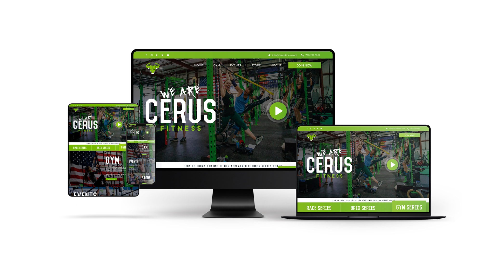
How to Design a Website in Adobe Illustrator in 2024

How to Design a Website in Adobe Illustrator in 2024

Table of Contents

Section 1: Introduction to Web Design with Adobe Illustrator

  1. Introduction: The Evolution of Web Design with Adobe Illustrator
  2. The Power of Digital: Elevating the Brand Experience in 2023
  3. Setting the Stage: Preparing Your Illustrator Workspace
  4. Why Web Design Matters:** Building Trust and Authenticity
  5. Embracing Change: Web Design Trends for 2024
  6. The Illustrator Advantage: Vector vs. Bitmap Graphics
  7. Collaboration: Working with Web Design Agencies

Section 2: Navigating the Design Process

  1. Kickstarting the Design: Using artboards for Layouts
  2. Fluid Designs: Crafting Responsive Web Layouts
  3. Asset Management: Harnessing Illustrator’s Libraries
  4. Creativity Unleashed: Utilizing Illustrator’s Vector Tools
  5. Branding: Synchronized Color Themes and Typography
  6. Boosting Efficiency: Top Illustrator Plugins in 2024
  7. From Design to Development: Exporting Web-Ready Assets

Section 3: Perfecting and Publishing Your Design

  1. Design Evaluation: Testing Across Devices and Browsers
  2. Iteration: Importance of User Feedback in Design Refinement
  3. Integration: Merging Illustrator Designs with Web Platforms
  4. The Final Touch: Enhancements and Add-ons for Your Website
  5. Going Live: Launch Checklist for Your Illustrator-Designed Website
  6. Looking Ahead: Maintaining and Updating Your Design
  7. Conclusion: The Future of Web Design with Adobe Illustrator

SECTION 1: The Evolution of Web Design

The digital age has rapidly evolved, and with it, the world of web design. From simple text-based web pages to today’s immersive, interactive experiences, the transformation is nothing short of remarkable. And a crucial tool driving this evolution is Adobe Illustrator, a software that has remained a favorite for designers worldwide. As we step into 2024, let’s delve into how to harness the power of Adobe Illustrator for your website designs.

Why Adobe Illustrator?

Adobe Illustrator offers vector-based graphics which means your designs remain crisp and scalable, regardless of the screen size. This is a must in today’s diverse device ecosystem. Moreover, with the ever-growing importance of a new business website, Adobe Illustrator ensures your designs aren’t just beautiful but also functional.

Setting the Foundation

Before jumping into the design, always start by understanding the objective of the website. Are you trying to elevate a brand experience like many premium branding solutions out there? Or perhaps provide a streamlined user experience? Know your goal, and let it guide your design.

Starting Your Design Journey in Adobe Illustrator

Setting Up Your Canvas

  1. Open Adobe Illustrator: Launch the program and create a new document.
  2. Select Web Preset: Choose the ‘Web’ preset. This will automatically set your workspace dimensions optimized for web design.
  3. Adjust Artboard: Customize the artboard size based on your specific needs. Remember, responsive design is key.

Designing the Layout

With your canvas ready, now comes the fun part – designing!

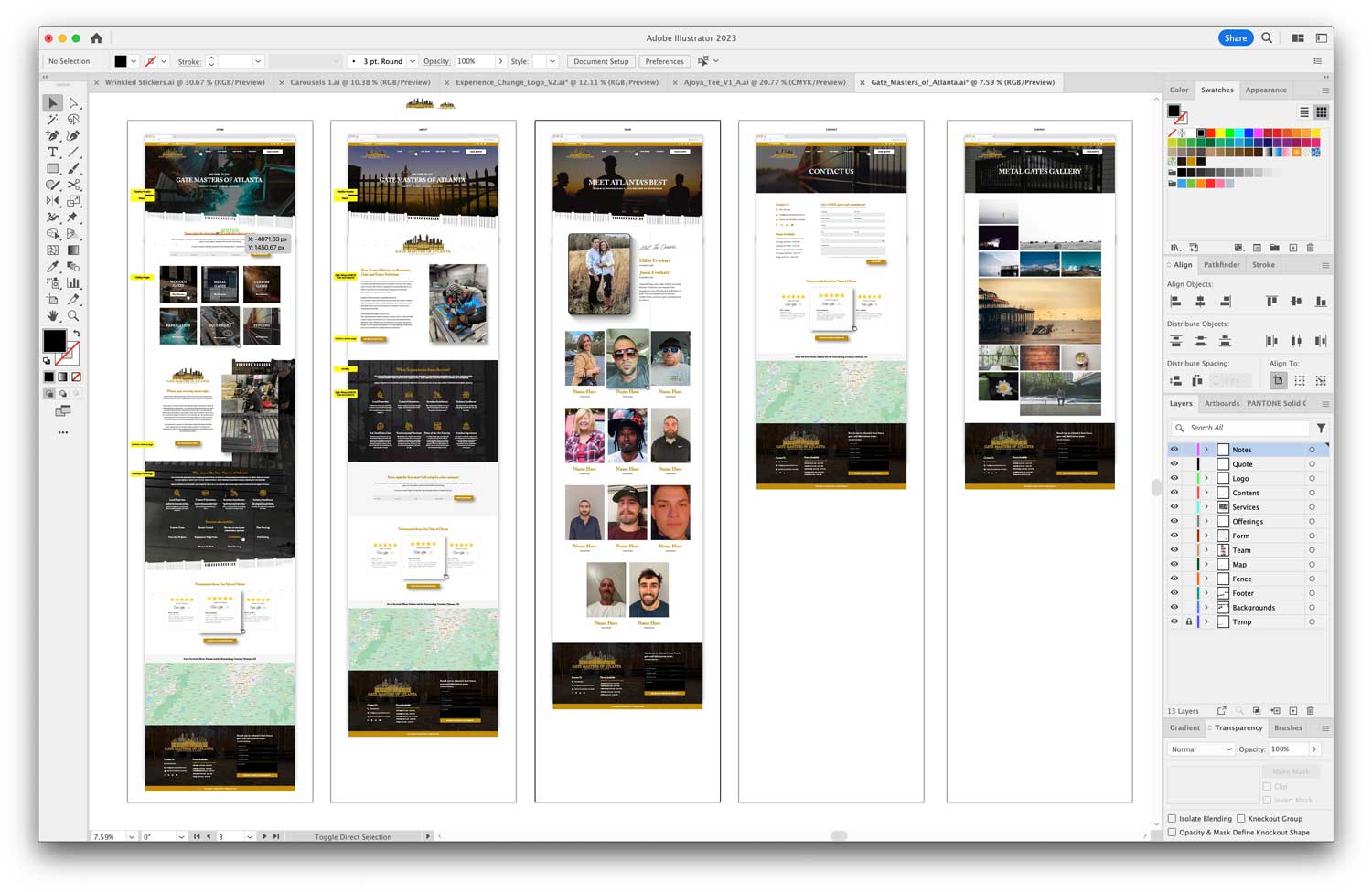
  1. Use Grids: Grids help maintain consistency and alignment. You can easily set them up by going to ‘View’ > ‘Show Grid’.
  2. Wireframe: Sketch out a rough layout. This helps visualize the user flow and site structure.
  3. Play with Colors: Ensure the colors resonate with the brand’s message. Using color guides in Illustrator can be immensely helpful.
  4. Typography Matters: Choose fonts that are web-safe and readable. Adobe Illustrator offers a plethora of typeface options to pick from.

Elements that Make Your Design Stand Out

Icons and Graphics

A picture speaks a thousand words. Design or choose relevant icons that add value to the content. Illustrator’s vector-based design ensures these graphics are sharp and versatile.

Interactive Elements

Interactive buttons, drop downs, and sliders can elevate a user’s experience. While Illustrator is primarily a design tool, you can visualize how these elements would function in the final site. Working closely with a web design and development agency can help turn these visions into reality.

Exporting and Integration

Once you’re satisfied with the design, it’s time to export. Illustrator offers multiple export options optimized for web. Ensure you collaborate with your developer for smooth integration.

In the upcoming sections, we’ll delve deeper into advanced Illustrator techniques, ensuring your website not only looks good but also performs seamlessly.

SECTION 2: Advanced Techniques in Adobe Illustrator for Web Design

Embracing the Power of Layers

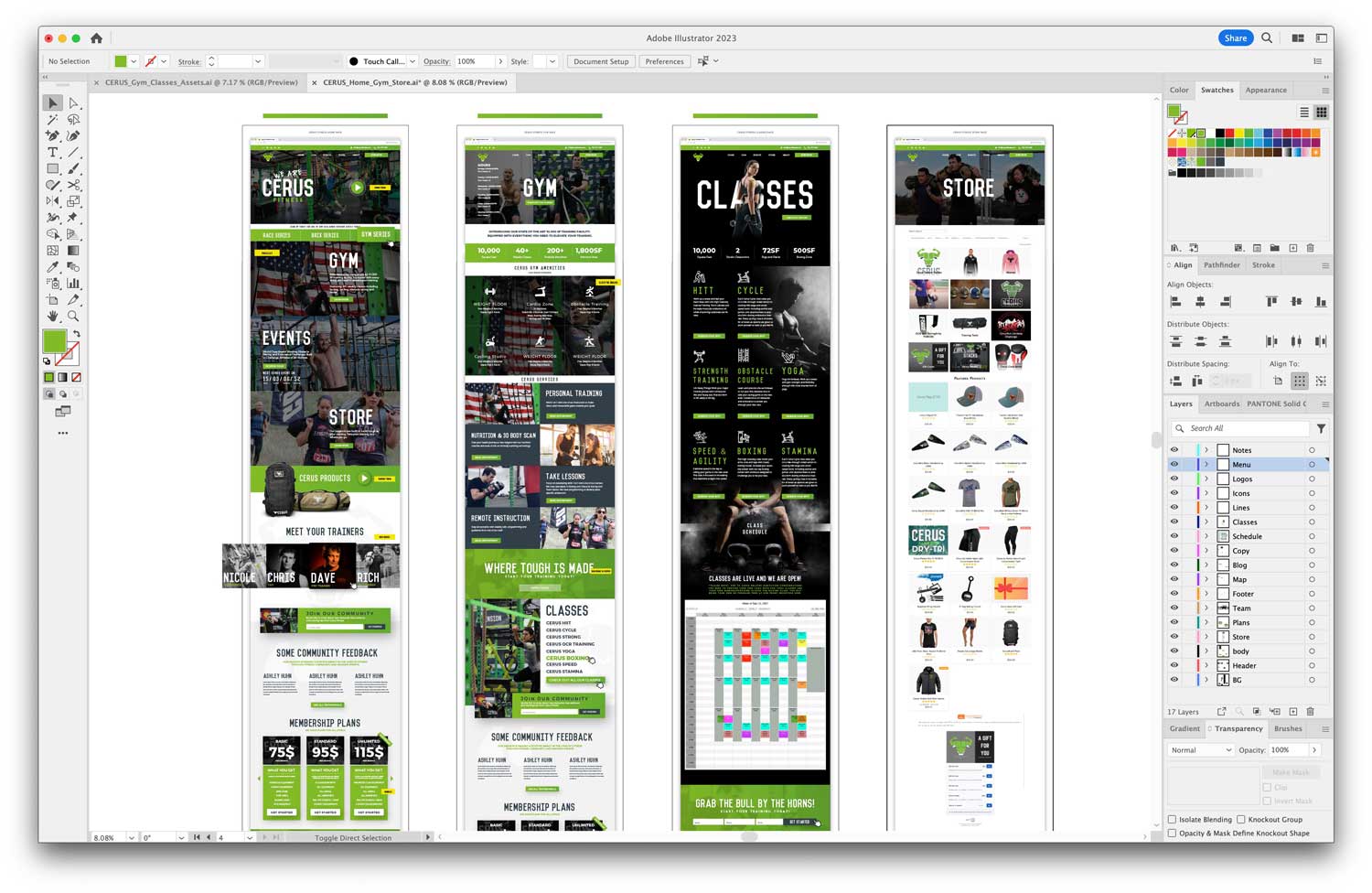
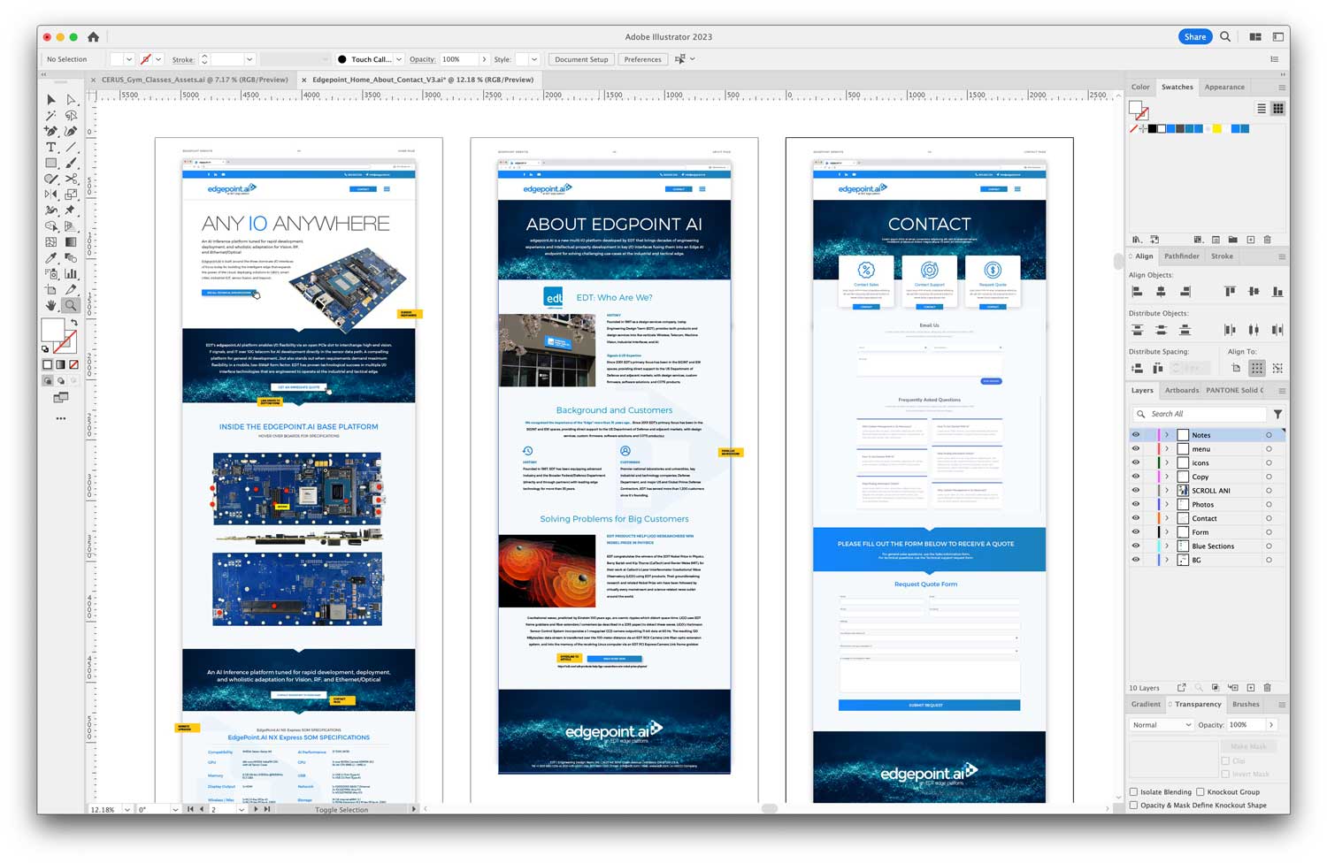
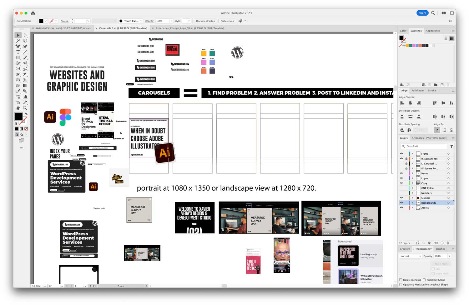
Working with layers in Adobe Illustrator can significantly streamline your design process. Layers allow you to separate different elements, making it easier to edit and organize your design.

Benefits of Using Layers

  1. Isolation: Easily isolate and work on specific parts of your design without affecting other elements.
  2. Organization: Group related items together, making the design process more systematic and efficient.
  3. Flexibility: Toggle visibility, lock specific layers, and adjust opacity to achieve the desired effect.

Harnessing Illustrator’s Plugins and Extensions

The beauty of Illustrator lies in its extensibility. Various plugins and extensions are available that can enhance your web design capabilities.

Must-Have Plugins for Web Designers

  1. VectorScribe: This tool enhances your vector designing capability, allowing for more intricate details.
  2. MagicPicker: An advanced color wheel plugin to refine your color selection process, ensuring brand consistency.
  3. InkScribe: Streamlines the drawing process, perfect for creating intricate icons and graphics.

Tips for a Responsive Design in Illustrator

In 2024, responsiveness isn’t just a trend; it’s a necessity. With a myriad of devices available, your design must look impeccable on all screen sizes.

Creating Adaptive Designs

  1. Use Symbols: Any changes made to a symbol are automatically updated everywhere it’s used. This is perfect for elements like logos or icons that repeat across web pages.
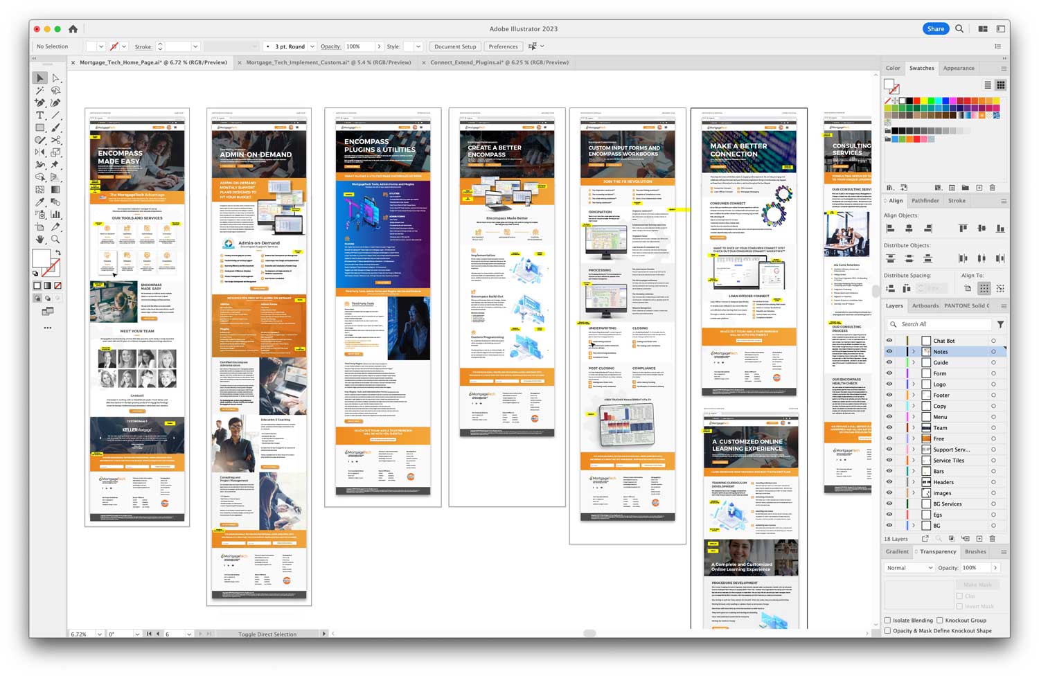
  2. Artboard Tool: Utilize the Artboard tool to visualize your design on various screen sizes, ensuring consistency and adaptability.
  3. Linking Assets: Illustrator allows you to link assets from Adobe’s Creative Cloud. This ensures that you always use the latest versions of logos, icons, and other assets.

Collaborating with Developers

Designing in Illustrator is just one part of the web development process. Close collaboration with developers is crucial to bring your design to life.

Handing Off Designs

  1. Export as SVG: For web, SVG format ensures scalability without loss of quality.
  2. Use Adobe’s XD: Adobe XD can be used in tandem with Illustrator for prototyping and to ensure a smoother handoff to developers.
  3. Detailed Documentation: Always provide developers with a detailed document outlining fonts, colors, and other design specifics. This reduces ambiguity and ensures fidelity to the original design.

In the next section, we will dive into the final touches, ensuring that your design is not only functional but also aligns with the latest web design trends and standards of 2024.

SECTION 3: Finalizing and Launching Your Web Design

Testing and Iteration

Once your design is complete, testing is an essential step. This ensures that your design not only looks great but also provides an optimal user experience.

Testing Across Different Devices

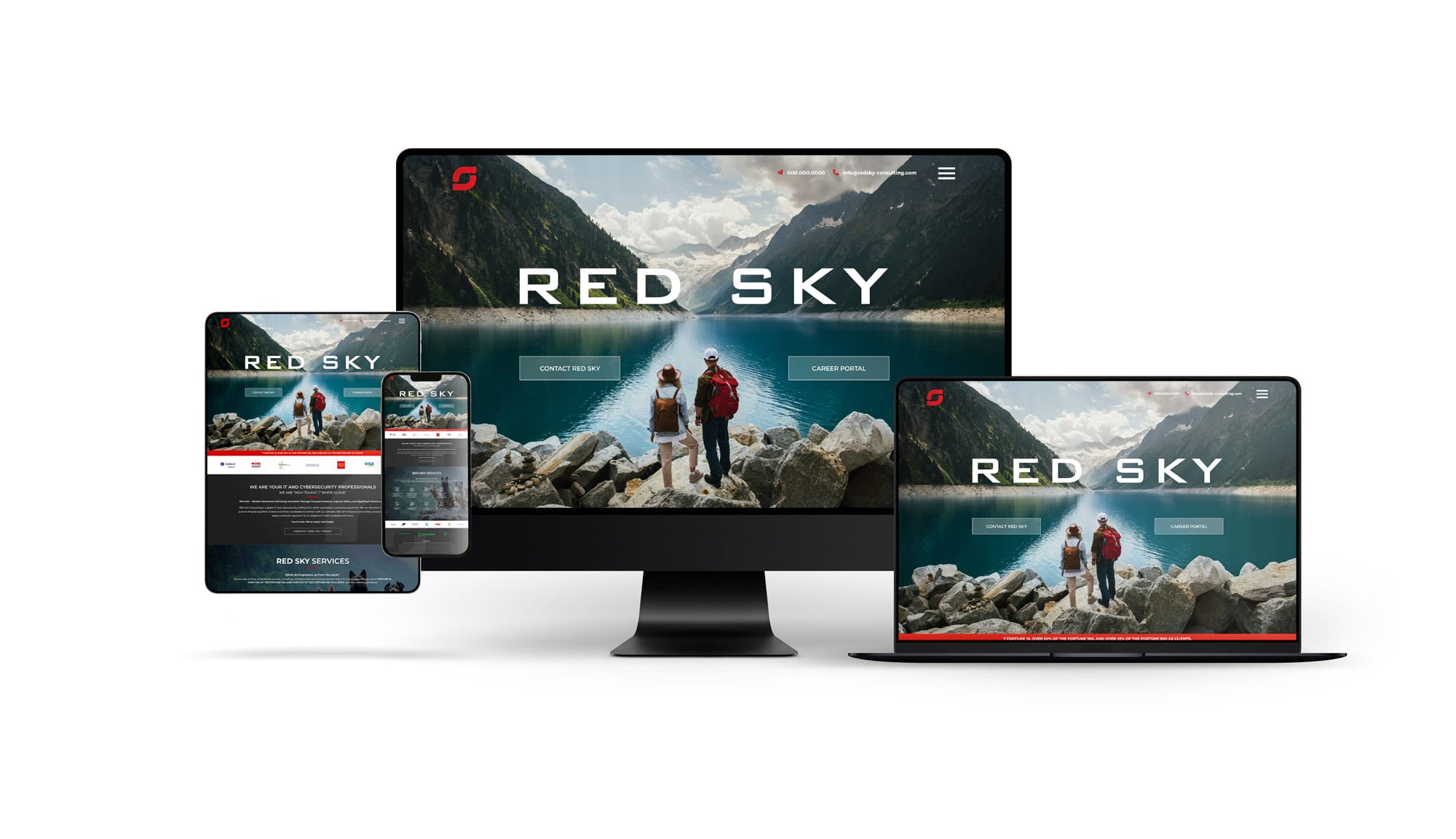
In the digital age, users access websites from a plethora of devices – from smartphones to large desktop monitors. It’s crucial to ensure consistent design and functionality across all platforms.

  1. Desktop Testing: Review the design on different screen resolutions and browsers.
  2. Mobile Testing: Check the responsiveness on tablets and smartphones, ensuring touch-friendly navigation.
  3. Cross-Browser Compatibility: Make sure your design is consistent and functional across browsers like Chrome, Firefox, Safari, and Edge.

User Feedback and Iteration

A design might look perfect to you, but it’s the end-users whose opinions matter most. Gathering feedback can reveal areas for improvement.

Methods of Gathering Feedback

  1. Surveys: Tools like Google Forms or SurveyMonkey can help gather structured feedback.
  2. User Testing Sessions: Watching real users interact with your design can provide invaluable insights.
  3. Analytics: Tools like Google Analytics can offer data on user behavior, helping pinpoint potential design issues.

Integrating SEO Best Practices

Having a beautifully designed website is just one piece of the puzzle. It also needs to be found. Integrating SEO best practices can significantly boost your site’s visibility.

Essential SEO Integration Steps

  1. Keyword Research: Using tools like AlsoAsked can provide insights into what potential visitors are looking for.
  2. Optimized Metadata: Ensure your title tags, meta descriptions, and headers are optimized for relevant keywords.
  3. Image Optimization: All images should have descriptive alt tags and be compressed without losing quality.

Launching Your Website

The culmination of your hard work is the launch. But, it’s not just about making your website live. It’s about ensuring a smooth transition and monitoring post-launch.

Launch Checklist

  1. Backup: Before making any changes, ensure you have a full backup of your website.
  2. Domain and Hosting: Ensure your domain is correctly pointed to your hosting provider.
  3. Monitor Traffic: After launch, monitor website traffic and user behavior to ensure everything is running smoothly.

In conclusion, designing a website in Adobe Illustrator requires a systematic approach, from the initial stages of design to the final launch. By following these steps, you can ensure a website that’s not only aesthetically pleasing but also user-friendly and search engine optimized.
 

🌐 Sources

  1. alsoasked.com – AlsoAsked: People Also Ask keyword research tool
  2. apus.libanswers.com – How can I pick the best keywords to use when researching my …
The Importance of a New Business Website

The Importance of a New Business Website

Table of Contents

  1. Section 1: Introduction to the Importance of a New Business Website
    • The Digital Frontier
    • Why You Need a New Business Website
    • Key Features of a New Business Website
    • Conclusion
  2. Section 2: Building Your New Business Website
    • Define Your Goals
    • Choose the Right Domain Name
    • Plan Your Website Structure
    • Design Your Website
    • Create Compelling Content
    • Optimize for SEO
    • Test and Launch
    • Promote Your Website
    • Monitor and Improve
    • Conclusion
  3. Section 3: Growing and Maintaining Your New Business Website
    • Content Updates
    • Social Media Integration
    • Email Marketing
    • Online Advertising
    • Analytics and Monitoring
    • Mobile Optimization
    • Security
    • Customer Feedback
    • Local SEO
    • Collaborate and Network
    • Conclusion

Section 1: Introduction to the Importance of a New Business Website

In today’s digital age, having a strong online presence is crucial for the success of any business. One of the fundamental aspects of establishing this online presence is creating a new business website. In this article, we will explore the significance of a new business website and how it can benefit your company. We’ll also delve into essential considerations and best practices for building a website that not only looks great but also performs exceptionally well in the online marketplace.

The Digital Frontier

The internet has transformed the way businesses operate. It has become the primary platform where customers discover, engage with, and ultimately choose the products and services they need. As a result, having an effective online presence is no longer optional; it’s a necessity.

Why You Need a New Business Website

  1. Visibility and Accessibility: A well-designed website ensures that your business is visible to potential customers 24/7. It serves as a digital storefront, allowing people to learn about your offerings at their convenience.
  2. Credibility: A professionally designed website builds trust and credibility. It reflects your commitment to providing quality products or services.
  3. Brand Identity: Your website is an opportunity to showcase your brand’s identity. From the color scheme to the logo, it’s a chance to make a memorable impression.
  4. Marketing Hub: Your website can serve as the central hub for all your digital marketing efforts, including social media, content marketing, and email campaigns.

Key Features of a New Business Website

To maximize the impact of your website, it’s essential to consider the following features:

Responsive Design

A responsive design ensures that your website looks and functions well on various devices, including smartphones, tablets, and desktop computers.

User-Friendly Navigation

Intuitive navigation makes it easy for visitors to find the information they’re looking for. A clear menu and well-structured content are vital.

Compelling Content

Engaging and informative content not only attracts visitors but also keeps them on your site longer. It’s an opportunity to showcase your expertise.

SEO Optimization

Search engine optimization (SEO) techniques help your website rank higher in search engine results, increasing its visibility to potential customers.

Contact Information

Make it easy for visitors to get in touch with you by prominently displaying contact information.

Social Media Integration

Link your website to your social media profiles to expand your online presence and encourage social sharing.

Security

Protecting your website and customer data is crucial. Implement security measures to safeguard against cyber threats.

Conclusion

In conclusion, a new business website is not just an online brochure; it’s a dynamic tool that can significantly impact your business’s success. In the next sections, we will explore website development strategies and delve deeper into the various aspects discussed here. Stay tuned for more insights on creating a powerful online presence for your new business.

Sources

  1. GNT Branding – Websites
  2. GNT Branding – All Projects
  3. GNT Branding – Branding

In the next section, we will explore the steps involved in planning and designing your new business website.

Section 2: Building Your New Business Website

Now that we’ve established the importance of having a new business website, let’s delve into the practical steps involved in planning and building your online presence. A well-executed website can become a powerful tool for attracting and retaining customers. Here’s how you can get started:

1. Define Your Goals

Before you begin designing your website, it’s crucial to outline your objectives. What do you want to achieve with your online presence? Are you looking to increase sales, generate leads, or provide valuable information to your audience? Clearly defining your goals will guide your website’s structure and content.

2. Choose the Right Domain Name

Selecting a memorable and relevant domain name is essential. It should reflect your brand and be easy to spell and remember. Ensure that your chosen domain is available and register it promptly.

3. Plan Your Website Structure

Organize your website’s content logically. Create a sitemap that outlines the main pages and their hierarchy. This will help visitors navigate your site efficiently.

4. Design Your Website

The design of your website plays a significant role in user experience. Consider the following design elements:

Aesthetics

Choose a visually appealing design that aligns with your brand. Use a consistent color scheme and typography to create a cohesive look.

Responsiveness

Ensure that your website looks and functions well on all devices. Responsive design is vital for providing a seamless experience.

User-Friendly Navigation

Implement an intuitive menu and navigation system. Visitors should easily find what they’re looking for.

5. Create Compelling Content

Content is king in the online world. Develop high-quality, informative, and engaging content for your website. This includes:

Homepage

Craft a compelling homepage that immediately conveys your value proposition and encourages visitors to explore further.

About Us

Tell your brand’s story and mission. Make a personal connection with your audience.

Products or Services

Provide detailed information about your offerings. Use clear descriptions and high-quality images.

Blog

Maintain a blog to share industry insights, tips, and updates. This establishes your authority and keeps visitors coming back for more.

6. Optimize for SEO

To improve your website’s visibility in search engines, implement SEO best practices:

Keyword Research

Identify relevant keywords and integrate them naturally into your content.

On-Page SEO

Optimize meta titles, descriptions, headings, and image alt text.

High-Quality Backlinks

Acquire authoritative backlinks to boost your website’s authority.

7. Test and Launch

Before going live, thoroughly test your website for functionality, compatibility, and speed. Ensure that it performs optimally across different browsers and devices. Once you’re satisfied, it’s time to launch your new business website.

8. Promote Your Website

After the launch, actively promote your website through various channels, including social media, email marketing, and paid advertising. Encourage visitors to share your content.

9. Monitor and Improve

Regularly monitor your website’s performance using analytics tools. Track metrics such as traffic, conversion rates, and user behavior. Use this data to make continuous improvements to your website.

Conclusion

Building a new business website is a dynamic process that requires careful planning and execution. By following these steps and incorporating the principles discussed in the previous section, you can create a powerful online presence that engages your audience and drives business growth.

In the final section, we will explore additional strategies to maintain and expand your online presence effectively.

Sources

  1. GNT Branding – Websites
  2. GNT Branding – All Projects
  3. GNT Branding – Branding

In the next section, we will discuss strategies for promoting and growing your new business website.

Section 3: Growing and Maintaining Your New Business Website

Congratulations on successfully launching your new business website! Now, it’s time to focus on strategies to promote growth and ensure its long-term success. In this final section, we’ll explore key actions to maintain and expand your online presence.

1. Content Updates

Continuously update your website with fresh and relevant content. Regular blog posts, news articles, or product updates not only keep your audience engaged but also signal to search engines that your site is active and valuable.

2. Social Media Integration

Integrate social media buttons and feeds into your website. This allows visitors to easily share your content on their social networks, increasing your online reach and engagement.

3. Email Marketing

Leverage email marketing campaigns to stay in touch with your audience. Send newsletters, promotions, and updates to keep subscribers informed and engaged.

4. Online Advertising

Consider running online advertising campaigns, such as Google Ads or social media ads, to drive targeted traffic to your website. Set a budget and monitor the performance of your ads.

5. Analytics and Monitoring

Continuously analyze website traffic and user behavior using tools like Google Analytics. Identify areas for improvement and adjust your content and strategies accordingly.

6. Mobile Optimization

With the increasing use of mobile devices, ensure that your website remains mobile-friendly. Regularly test and optimize for mobile users to provide a seamless experience.

7. Security

Maintain strong security measures to protect your website and customer data. Regularly update plugins, software, and use SSL certificates for secure transactions.

8. Customer Feedback

Collect feedback from visitors and customers. Use surveys, contact forms, or comments sections to gather insights and make improvements based on their suggestions.

9. Local SEO

If your business has a physical presence, optimize your website for local SEO. This includes creating a Google My Business profile and ensuring your business information is accurate and consistent across online directories.

10. Collaborate and Network

Explore partnerships and collaborations with other businesses in your industry. Networking can lead to valuable opportunities for cross-promotion and audience expansion.

Conclusion

Your new business website is a dynamic asset that requires ongoing attention and optimization. By implementing these strategies and staying committed to providing value to your audience, you can ensure the long-term success of your online presence.

Remember that the digital landscape is constantly evolving, so staying up-to-date with industry trends and technology is essential. Keep experimenting, learning, and adapting to maintain a competitive edge in the online marketplace.

Thank you for joining us on this journey to explore the world of new business websites. We wish you the best of luck in building and growing your online presence!

Sources

  1. GNT Branding – Websites
  2. GNT Branding – All Projects
  3. GNT Branding – Branding

This concludes our three-part series on New Business Websites. We hope you found this information valuable and informative. If you have any questions or need further assistance, please feel free to reach out. Good luck with your new business website journey!


FAQ Section

🗒️ Answer

1. What is the purpose of creating an FAQ page on a website?

Creating an FAQ (Frequently Asked Questions) page on a website serves several purposes:

  • Customer Self-Service: An FAQ page allows customers to find answers to common questions on their own, reducing the need for direct customer support.
  • Information Accessibility: It provides easy access to essential information about products, services, policies, and more.
  • Enhanced User Experience: It improves the overall user experience by offering clear and concise answers to common queries.

2. What are some examples of stellar FAQ pages?

Here are examples of well-crafted FAQ pages:

  • Zendesk’s FAQ Page: Zendesk’s FAQ page offers comprehensive answers and a user-friendly design.
  • HubSpot’s FAQ Page: HubSpot’s FAQ page includes crystal-clear answers to commonly asked questions.

3. How can I create an effective FAQ page for my website?

To create an effective FAQ page, follow these steps:

  • Identify common customer questions.
  • Organize questions logically into categories.
  • Write clear and concise answers.
  • Use user-friendly formatting and design.
  • Ensure easy navigation and search functionality.
  • Keep the FAQ page updated with new information.

4. Are there any best practices for FAQ page design?

Yes, some best practices for FAQ page design include:

  • Use clear headings and subheadings.
  • Include a search bar for easy navigation.
  • Use an accordion-style layout to hide answers until clicked.
  • Make it mobile-friendly for a seamless user experience.
  • Use visuals like icons or images to enhance comprehension.
  • Keep answers concise and to the point.

🌐 Sources

  1. Zendesk – 19 stellar FAQ page examples and how to create one
  2. HubSpot – 12 Crystal-Clear FAQ Page Examples & How to Make Yours
F@#&in’-A-Write: The Power of Profanity in Marketing

F@#&in’-A-Write: The Power of Profanity in Marketing

TABLE OF CONTENTS

1. Introduction: The Bleepin’ Power of Profanity
1.1. The Buzz: Why Everyone’s Talking About It
1.2. The Evolution of “Taboo”: How Language is Always Changing
2. The Science of Swearing: It’s Not All Bad Words
2.1. Emotions and Expletives: The Brain’s Response
2.2. The Recall Factor: How Curse Words Stick in Memory
3. Profanity’s Prowess in Pop Culture
3.1. How Top Brands Are Swearing Their Way to Success
3.2. From Movies to Memes: Profanity’s Grip on Our Attention
4. Breaking Down Barriers: The Real-talk Aspect
4.1. Building Authenticity: Why Audiences Connect with Candor
4.2. The Age of “Relatability”: Profanity’s Role in Making Brands More Human
5. SEO Benefits: F@#&ing Boost Your Rankings
5.1. Unconventional Keywords: Standing Out in Search Results
5.2. Engaging Content = Better SEO: How Profanity Can Play a Part
6. The Risks and Rewards
6.1. When It Works and When It Doesn’t
6.2. Treading Carefully: Understanding Cultural and Demographic Differences
7. Navigating the Minefield: How to Use Profanity Wisely
7.1. Knowing Your Audience: A Bleepin’ Important First Step
7.2. Balancing Act: Don’t Overdo the Swear Jar!
8. Case Studies: Brands that Swore and Scored
8.1. The Unexpected Heroes: Conservative Brands that Took the Plunge
8.2. Learning from Slip-Ups: Brands that F@#&ed Up and How They Recovered
9. The Road Ahead: Predictions for the Foul-Mouthed Future of Marketing
9.1. Will the Trend Last or Are We Just F@#&ing Around?
9.2. The New Marketing Frontier: Opportunities for Brands Willing to Take Risks
10. Conclusion: To Swear or Not to Swear? That’s the F@#&ing Question

F@#&IN’-A-WRITE: THE POWER OF PROFANITY IN MARKETING

Ok, let’s get this out of the way right now. Obviously, this article is going to contain profanity. So, if you’re someone who frequently calls the cops on “disorderly skateboarding youths”, or you eagerly volunteered to be your dorm’s RA, or you happen to be a huge fan of Christian Rock (the old stuff, not this new-age inclusive patootie) then please swipe left on this post and get back to drinking chamomile tea with your 6 cats or whatever cuz this one ain’t for you.

Ok, now that it’s just us cool kids, hey fuckers, how are ya? Let’s talk about why you should be adding a little linguistic sauce to your marketing content and copy.

“Under certain circumstances, urgent circumstances, desperate circumstances, profanity provides a relief denied even to prayer.” – Mark Twain

1. Introduction: The Power of Profanity

Profanity is to communication as Florida is to the United States. Technically unnecessary, and you could probably make a case that we’d be better off without it altogether, but deep down inside you know we need it around because at the very least stories that contain a lot of it are almost always very fucking funny.

Sometimes, well-placed expletives are a necessary part of dialogue. If movies, to use one example, have taught us anything, it’s that actors like Samuel L. Jackson would be Samuel L. Who The Fuck Are You Talking About, if we didn’t know about his tremendous disdain for motherfuckin’ snakes on motherfuckin’ planes. And just as in film, the world of marketing is beginning to recognize the undeniable power of profanity.

1.1. The Buzz: Why Everyone’s Talking About It

From startups bros, to mainstream agencies, to TikTok tween queens or whatever they’re called, anyone with some shit to sell you is hopping on the F train. But why the bleep(fuck) exactly are brands evolving on their definitions of what ‘professional’ content means in their marketing strategies? THE REAL REASON MIGHT SHOCK YOU! (No it won’t)

1.2. The Evolution of “Taboo”: How Language is Always Changing

At one point, “bloody” was the edgiest word in the British dictionary. Then famously, in 1985, Irish singer-songwriter Bob Geldof made history when he said, “Just give us the fuckin’ money!” on live television, during the BBC’s Live Aid charity telethon. It made international news, and was recast (censored for the frail of course) for months. Incidentally, it also made the charity event a literal shit-ton of money. Fast forward a bit to 2020, the number one single for four weeks straight was Cardi B & Megan Thee Stallion’s pivotal, feminist, musical-manifesto W.A.P, which today even your sweet, innocent grandmama knows stands for “Wet-Ass Pussy”. Times change, so should our discourse.


2. The Science of Swearing: It’s Not All Bad Words Bitch

2.1. Emotions and Expletives: The Brain’s Response

According to a Dr. Richard Stephens, a scientist with too much free time on his hands and whose name I simply MUST point out is Dick, profanity can actually increase one’s pain tolerance. His study, unimaginatively titled, “Swearing as a Response to Pain”, found that letting out some occasional off color expletives can actually act as a coping mechanism (1). Translate that into some wet-ass marketing, and you’re actually helping your demos cope with their pain.

2.2. The Recall Factor: How Profanity Sticks

Let’s be honest, you’re more likely to remember a slogan that swears atcha a lil’ bit, over the thousands of others that don’t. Or even the insinuation or profane language can be memorable. Campaigns like Kmart’s “Ship My Pants” or Jell-O’s “Fun My Life” are hella better than that of their g-rated competitors. We have data on this: strong emotional responses, like the kind you get from your local Ford dealer telling you to, “Shut the Truck Up”, improve memory recall (2).

3. Profanity’s Prowess in Pop Culture

3.1. How Top Brands Are Swearing Their Way to Success

Anyone heard of this little known, multimillion dollar game company Cards Against Humanity? Their entire brand is built on pushing boundaries, capitalizing on awkward subject matter, and they’re fucking killing it. From historically untouchable topics in ads to downright salacious social media posts, brands are learning that a little sauce goes a long way these days.

Let’s not forget that influencers like Gary Vee have been perfecting profanity as a profession for almost a decade. So much so that swearing has become an integral part of Gary’s brand. When he’s not shaking down MaMa and PopPop to shave 50 cents off of the Mickey Mantle rookie baseball card he just found at their garage sale, or telling high school kids that college is for fuckin losers, then he’s dropping f-bombs and creating viral content on the daily.

Fuckin’ Gary Vee, man.

4. Breaking Down Barriers: The Real-talk Aspect

4.1. Building Authenticity: Why Audiences Connect with Candor

Buyer markets and digital demographics today are very smart. More importantly however, unlike the same markets of just 20/25 years ago, they know what they want, and they’re much harder to persuade. With the exception of legacy giants like Nike and Apple, they don’t just buy  “brands”, they want real people. And sometimes, real people talk like Richard Pryor on the set of a Tarantino movie.

4.2. The Age of “Relatability”: Profanity’s Role in Making Brands More Human

Brands like Wendy’s are killing the Twitter game with their witty and often edgy comebacks and online tête-à-têtes. Public conversations with a candor and tone that would have been unthinkable just a few years ago. If your brand had a voice, would it be a stiff boardroom executive, or a stiff bedroom executive? Leave your UUGG for that last sentence in the comments.

5. SEO Benefits: F@#&ing Boost Your Rankings

5.1. Unconventional Keywords: Standing Out in Search Results

Every brand is optimizing for “best shoes” or “affordable laptops”. But how many are optimizing for “best goddamn shoes you’ll ever wear”? It’s untapped, unique, and quite frankly, a brilliant SEO move.

5.2. Engaging Content = Better SEO: How Profanity Can Play a Part

Forget the algorithms for a sec. People share content that’s funny, relatable, and different. Profanity in relatable content is the new cat playing a piano or that cannibal Charlie video. More fuckin’ exposure means better fuckin’ SEO.

6. The Risks and Rewards

6.1. When It Works and When It Doesn’t

Now, it’s not all rainbows and flying unicorns. The key is knowing when to drop an f-bomb and when to keep it clean. Using profanity in UNICEF ad copy? Maybe not so much. But selling antidepressants to dogs or progressive auto insurance? Flow will tell you what the fuck is up.

6.2. Treading Carefully: Understanding Cultural and Demographic Differences

Remember, what’s funny to one culture might be soops offensive to another. So do your research and probably steer clear of the Amish. All due respect, Zebadiah.

7. The Road Ahead: Predictions for the Foul-Mouthed Future of Marketing

7.1. Will the Trend Last or Are We Just F@#&ing Around?

With the current trajectory, profanity will most likely continue to play a more and more important role in online and mainstream ad copy and content.

7.2. The New Marketing Frontier: Opportunities for Brands Willing to Take Risks

As they say, fortune favors the bold. Or in this case, the profane.

8. Conclusion: To Swear or Not to Swear? The Ultimate F@#&ing Question

To wrap it up, language is evolving, and so is marketing. Using profanity can be a powerful tool, but like any other strategy or marketing methodology, it’s all about how you use and implement it. Your best bet is to hire someone funny, learn to be a little more open minded, and try not to offend unless absolutely necessary.

Thanks fuckers

To receive these rants every week sign up for our newsletter HERE

Disclaimer: This article is for brands with a sense of humor. Always remember to align your marketing strategies with your brand’s values and target audience.


 —


Footnotes

  1. Stephens, R., & Umland, C. (2011). Swearing as a response to pain – effect of daily swearing frequency. The Journal of Pain, 12(12), 1274-1281. ↩
  2. LaBar, K. S., & Phelps, E. A. (1998). Arousal-mediated memory consolidation: Role of the medial temporal lobe in humans. Psychological Science, 9(6), 490-493. ↩
Premium Branding Solutions: Elevating Brand Experience in 2023

Premium Branding Solutions: Elevating Brand Experience in 2023

Table of Contents

  1. Premium Branding Solutions: Elevating Brand Experience in 2023
  2. The Essence of Branding
  3. The 2023 Frontier of Promotional Items
  4. The Power of Tangible Branding
  5. Collaborating with Elite Retail Brands
  6. Superior Screen Printing & Embroidery
  7. Why World-Class Companies Trust GNT Branding
  8. The Allure of Custom Hats
  9. Expert Guidance for Your Queries
    • A Few Points to Consider

The Essence of Branding

We believe that branding transcends mere aesthetics; it evokes feelings and constructs emotional bonds with consumers. As your trusted corporate branding partner, our mission is to magnify your brand’s distinctive ethos. By blending impeccable design with well-thought-out strategy, we ensure your brand resonates in the hearts of your consumers, leaving an enduring imprint.

The 2023 Frontier of Promotional Items

Staying ahead of the curve is vital in today’s dynamic market. Our ensemble of trendspotters, innovators, and selectors continually monitor evolving trends, crafting experiences that not only accentuate your brand but resonate deeply with today’s discerning audience.

The Power of Tangible Branding

A brand is not just a logo or a tagline; it’s an experience. With our expertise, transform your brand into a tactile sensation. Through meticulously designed custom merchandise and apparel, we curate experiences that fortify emotional bonds, enhancing the potency of your brand’s message.

Collaborating with Elite Retail Brands

Colorado recognizes us as a branding pinnacle, granting us the privilege to collaborate with some of the most illustrious retail brands. Dive into our continually growing catalog of esteemed retail brand associates and sculpt an unmatched branding experience for your clientele.

Superior Screen Printing & Embroidery

Your merchandise deserves to be unique. With cutting-edge screen printing and intricate embroidery techniques, we ensure your promotional items and apparel are a class apart, reinforcing a consistent and compelling brand image across every piece.

Why World-Class Companies Trust GNT Branding

From grassroots organizations to global conglomerates, our expansive portfolio is a testament to our unparalleled service quality. Our distinctive approach to branding, sourcing, and production has nurtured invaluable associations across diverse sectors, including hospitality, automotive, software solutions, beverages, and many more. With us, you’re not merely partnering with another agency; you’re aligning with the vanguard of branding excellence.

The Allure of Custom Hats

Narrate a compelling brand tale with our bespoke hat collection. Crafted to reflect your brand’s ethos, our hats incorporate top-tier fabrics, myriad logo embellishments, and refined touches such as interior prints and private labels. Embrace customization; as rightly said by CRAIG DAVID of AUDI FLATIRONS, “Details matter. Offering something unique always garners more appreciation.”

Expert Guidance for Your Queries

Embarking on a branding journey might raise multiple questions. Whether you’re uncertain about quantities, decoration methods, or even your budget, we’re here to guide you. Our adept branding team will assist you in tailoring solutions that align with your goals, budget, and timeframe.

A Few Points to Consider:

  • Logo Files: For optimal outcomes, provide logo files in Adobe Illustrator (.ai), EPS (.eps), or PDF (.pdf) format, preferably above 1MB.
  • Taxation: Clients in specific states might be subject to sales tax. Exemptions can be availed by providing a resale certificate.
  • Payments: We accept a myriad of payment methods, including ACH, company checks, all significant credit cards, and pre-approved Net 30 terms.
  • Design Assistance: Our design maestros are at your service to refine your files for production, subject to minimal charges based on specific requirements.

Elevate your brand’s horizon with us. Welcome to a journey of unparalleled branding excellence.

DON’T TALK TO ME UNLESS IT’S ABOUT THE ROMAN EMPIRE

DON’T TALK TO ME UNLESS IT’S ABOUT THE ROMAN EMPIRE

THIS IIIIISSS JEOPARDYYYY
Topic: Antiquity
Question: “What do you get when you cross the Vikings with an American Express Black Card and the generational entitlement of a Silicon Valley CEO’s 18 year old son?”
Answer: “What is, ‘The Roman Empire’ Alex?

Question: Why are men thinking about the Roman Empire?

The Romans were a people known for three things: aqueducts, Christian vs. lion dance off competitions, and living rent free in the minds of 21st century men all over America. What we want to determine is why are men in 2023 so obsessed with an empire that fell (or so they would have you believe) more than 1500 years ago.

The Roman Empire began in 27 B.C., fell in 476 A.D., and then in 2023, ROSE AGAIN, in the most based way possible, by going viral on TikTok.

In hundreds of posts shared on social media, women, more inquisitive than Lil Jon, have been asking the men in their lives how often they think about The Roman Empire. “Constantly,” one husband responded. “Like, every day,” said some other idiot. And one woman, upon making similar inquiries of her beloved, found that not only did her husband think about the empire quite often, but in actuality he was obsessed with it. So much so that he and his fellow Romaniac buddies would regularly go down to the local males-only bathhouse and spa to – as he put it to her – vigorously reenact famous Roman battles and practice ancient hand-to-hand combat techniques. Committing to their hobby so passionately that they would often come home days later exhausted, sweating and barely able to stand. True dedication to the memory of a glorious empire.

But what is it specifically that fascinates men so much about these robed-up, sandals in the winter wearin’ bad boys? Simple. The Roman Empire represents everything that the modern American man has lost in recent years to out of control progressivism, new-wave feminism and shady global elites, hell-bent on tearing down everything that said modern man has built with his own two hands!!

Well… I mean, more so what said modern man’s grandfather and father built with their own two hands and then passed down to said modern man through tax-loopholes and generational wealth, but you get it.


Anyway, The Empire represents a time when men used to be men. ALPHAS! These 4 foot 9 inch titans bowed to no one. They conquered everything and everyone in their paths. From weak and starving Frankish goat herders to illiterate and sickly Germanic farmers, to whatever the fuck the “Celts” were, The Romans spread the republic’s righteousness from King’s Landing in the south to Winterfell in the north. Don’t look that up.

The Romans represent everything the American man can become and embody the freedoms modern man is entitled to by birth right! Freedoms that are being stripped away from the modern man as you read this very article. Freedoms like the right to have a good time every now and again without being judged for trivialities like “drinking in the morning” or “are you dinking in the morning again, Richard?” or “I’m taking the kid’s to my mother’s, you do whatever the hell you want to do Richard. Have your fun, wear your stupid sandals in the winter, I just can’t live like this anymore.”.

So many rules, so much oppression, uugh!!

Why is the modern American man obsessed with the Roman Empire? Because it fell. And he feels like he’s next. Only a few decades ago, the American man was very much like the average ancient Roman aristocrat. A quintessential part of an apex culture and society; master of technology and shaper of worlds; respected and feared by millions, the sun never setting on that which he had conquered or colonized. The currency of the Romans was used across three different continents and it had military control over every major city from the Atlantic to the Caspian.

The empire had power beyond measure. And as such, it it became entitled, comfortable, and lazy. And so it fell. The modern American man can’t help but acknowledge the similarities between himself and the Roman and realize that his way of life may be at an end as well.

Two of these rants per week. Sign up for our newsletter below