ENCOMPASS | ICE | Premier Partner | Tech Services
MORTGAGE TECH
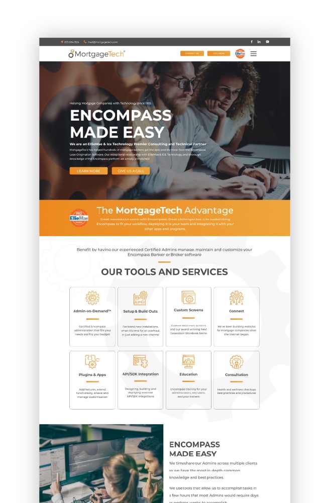
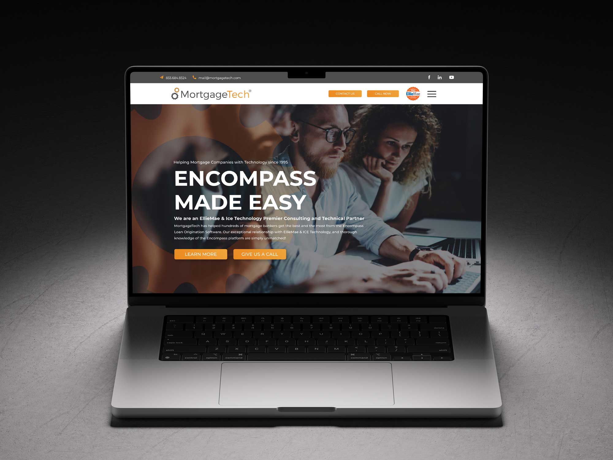
MORTGAGE TECH IS AN ICE MORTGAGE (FORMALLY ENCOMPASS) TECHNOLOGY PREMIER CONSULTING AND TECHNICAL PARTNER. THEIR DEDICATED CONSULTANTS ARE THE BEST AT WHAT THEY DO AND AS SUCH WE WANTED TO BUILD A WEBSITE THAT NOT ONLY HIGHLIGHTED THAT DEDICATION, BUT ALSO KEPT A VISITOR ATTENTION.
SERVICES
- Brand Design
- UI/UX Design
- CUSTOM Graphic Design
- CUSTOM ICON DEVELOPMENT
- Art Direction
- SEO Optimization
MORTGAGE TECH IS an ICE Mortgage Technology Premier Consulting and Technical Partner.
MortgageTech has helped hundreds of mortgage bankers get the best and the most from the Encompass Loan Origination Software. Our exceptional relationship with ICE Technology, and thorough knowledge of the Encompass platform are simply unmatched!
VISIT SITE HERE
GOALS
A WEBSITE FOR THE 21st CENTURY
–
Mortgage Tech exists in a niche space. A very, very niche space. Their demogrphic lives all over the country and numbers in the low thousands. So you can imagine that the certified Ellie Mae Encompass (now ICE) specialists at this Denver based consultancy have to know exactly what they are doing, because their clients are experts in their own fields.
Founder & CEO of Mortage Tech knew this when he came to us with a very simple request… “Please turn this tech heavy, niche-specific content into an eye-catching website that differentiates us from our competitors? We’re fighting for the attention of about a thousand people.”

BRAND UPDATE
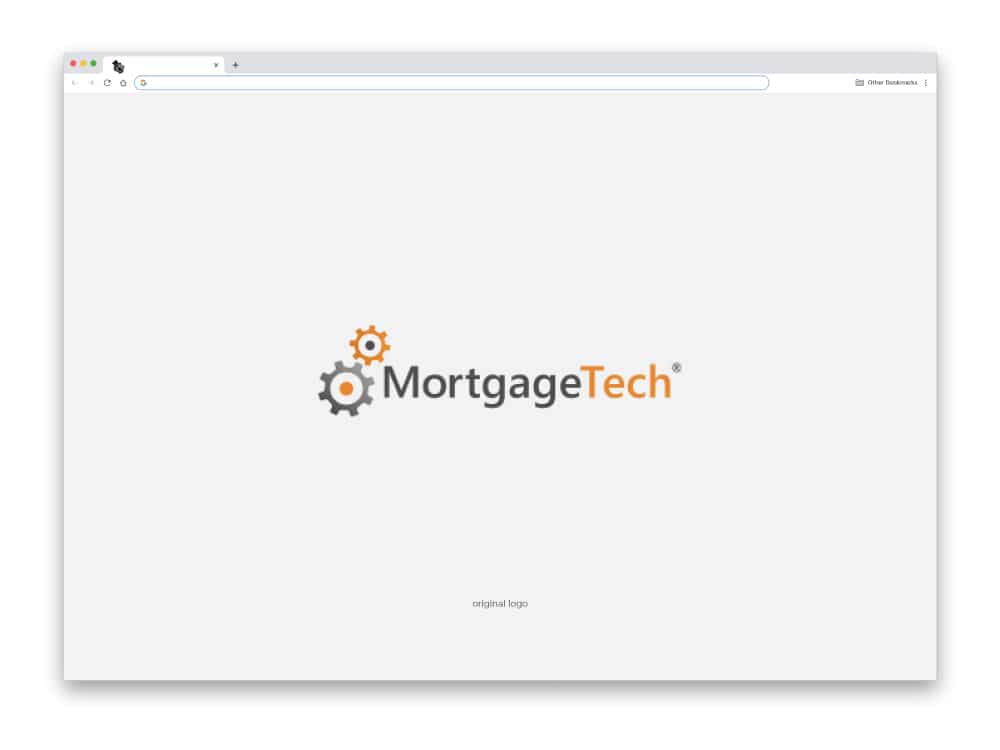
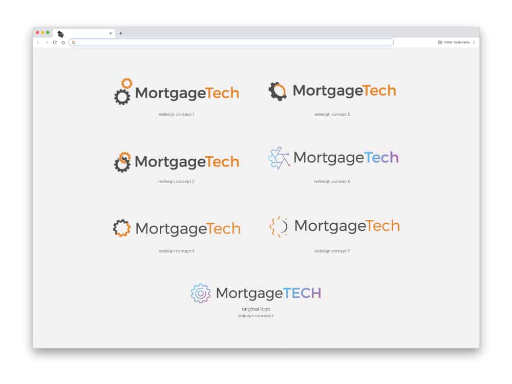
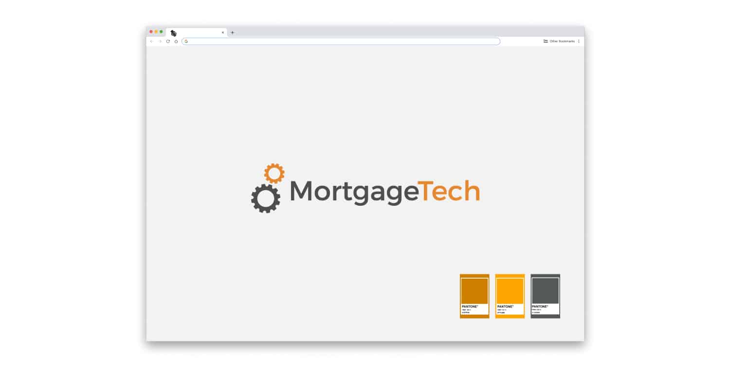
This was part an easier task than with most projects. Mortgage Tech had been around for several decades, so all their logo needed was just a quick refresh, before we could get started on the website. So we just spruced up their legacy logo, vectorized it, got rid of some gradients and drop shadow effects, and assigned some helpful Pantone values. Easy-peasy.

SOLUTIONS
COHESIVE AESTHETICS AND SMART GRAPHIC CHOICES.
–
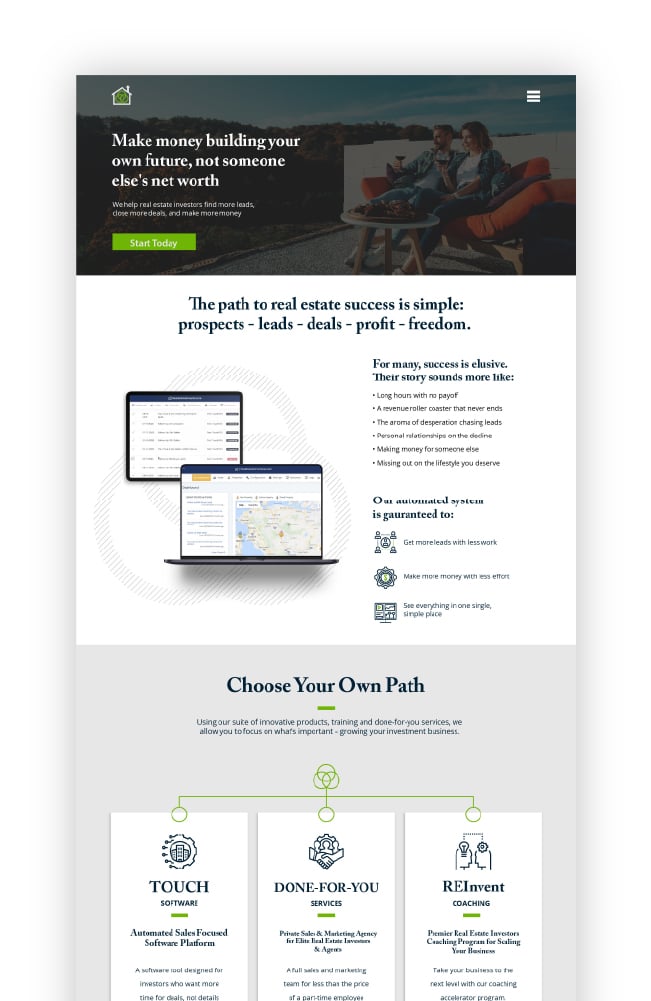
The website came together quite nicely, with a lot of great help and support from the Mortgage Tech team. We used a consistant, bright, color-scheme throughout the website reflecting the company’s established brand identity. We added the occasional animation here and there, and 3-D like graphic elements custom designed with modern device templates and filled with their proprietary software screenshots. Don’t worry, they were all images of older, depreciated software at time of launch. No secrets spilled.
All service icons and device mock ups were custom-made at the request of Steve and his team. All lead capture forms were connected to the CRM. They had been using for years.
RESULTS
A brand new website, successfully launched
AFTER A MONTH OF DEVELOPMENT, REVISIONS, AND SOME TECHNICAL TROUBLESHOOTING, WE LAUNCHED THE NEW WEBSITE IN 2021. THE MORTGAGE THAT TEAM WAS THRILLED TO FIND THEMSELVES WITH A FULLY FUNCTIONAL SITE THAT PUT ALL THEIR COMPETITION’S SITES TO SHAME.
