Fitness | Gym Life | Obstacle Races
CERUS FITNESS
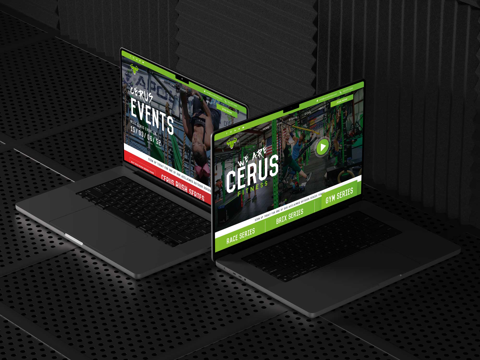
CERUS FITNESS BEGAN AS A PASSION PROJECT AT A LOCAL BOXING GYM, BUT OVER THE LAST SEVERAL YEARS HAS EXPLODED IN TO ONE OF THE MOST POPULAR WORKOUT AND RACING EVENT BRANDS IN COLORADO. WHEN OWNER AND VISIONARY CHRIS JOHNSON CAME TO GNT WITH HIS IDEA, WE KNEW WE NEEDED TO CREATE A WEBSITE AND THAT COMPLIMENT HIS AMBITION AS WELL AS DO JUSTICE TO HIS DRIVE AND VISION.
SERVICES
- Logo Development
- Brand Design
- UI/UX Design
- Graphic Design
- Icon Design
- Art Direction
- SEOptimization
The Cerus Fitness project was launched in 2017, based on the idea that for fitness to translate into lasting results, it must be part of an everyday lifestyle.
For a healthy and fit lifestyle to be sustainable, fitness needs to be more than workouts—it needs to bring together community and be accessible to all. It needs to provide a forum to test yourself and an opportunity to learn from your strengths and weaknesses athletically so you always have your next goal to strive for.
VISIT SITE HERE
GOALS
MULTIDISCIPLINARY EVENT & FITNESS COMMUNITY BRAND DEVELOPMENT
–
It started, as all great enterprises do, with a vision.
Chris Johnson, founder and CEO of CERUS Fitness had this idea that if you were to create a company built on community and driven by the human need to overcome obstacles, you could really go places. In Chris’ case, this was both literally and figuratively true.
Chris wanted to create a series of obstacle courses and endurance races as the foundation for his company’s development but also as the perfect vehicle for brand exposure and promotion. It was not just a brilliant concept, but an ultimately winning strategy.
Chris spent years building hundreds of race obstacles by hand in his garage on the weekends, and then years more getting up at the crack of dawn everyday to drive out to the course and install his obsitcles for the upcoming race that weekend.
What started as a passion project, turned into dozens of races year round and thousands of community memebers just waiting for their chance to sign up for the next one! Oh yeah, and if that wasn’t enough, he leveraged all the attention garnered through the events and bought a warehouse sized gymnasiun to serve as HQ for the brand, company and community.

A BRAND NEW WORLD
The first thing Chris needed was a logo.
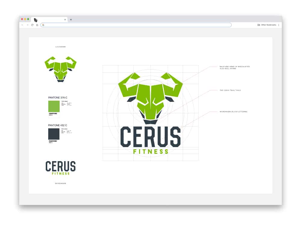
He came to us with the name CERUS – a wild bull from Greek mythology – already in mind, but needed a logo design that was not only memorable, and not just industry specific, but one that was capable of supporting all the event sub-brands that we would be developing next.
THE CERUS LOGO
After a week or two of playing around with different styles and font configurations for the lockup we landed on a minimal, almost start-up style, bull’s head icon where the back and arms of an athlete are taking the place of the bull’s horns. The fonts chosen – sturdy, rigid, san serifs – matched the logomark perfectly in their minimalist aesthetic and hyper-brandable nature. The end result was perfect. No bullshit 😉
CERUS RACE AND EVENT BRANDS
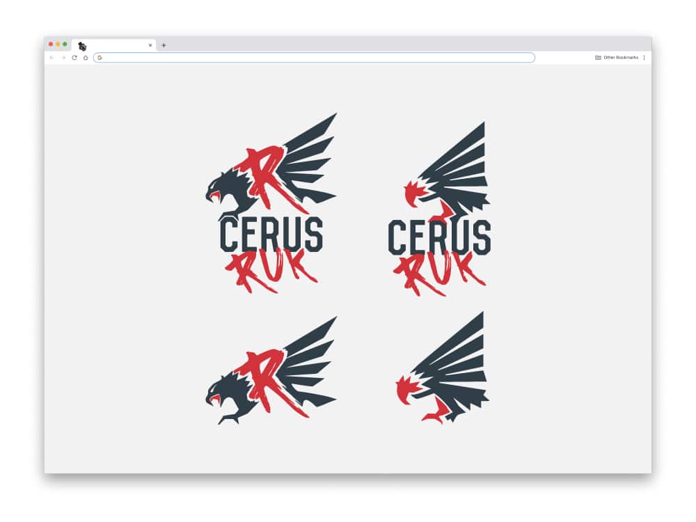
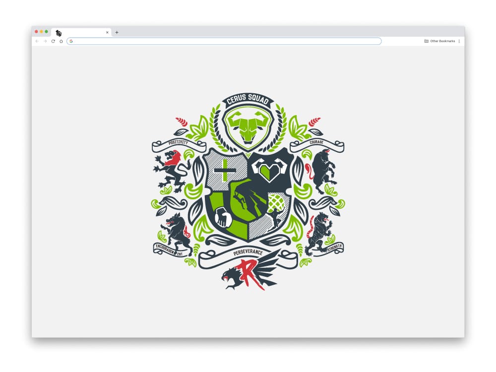
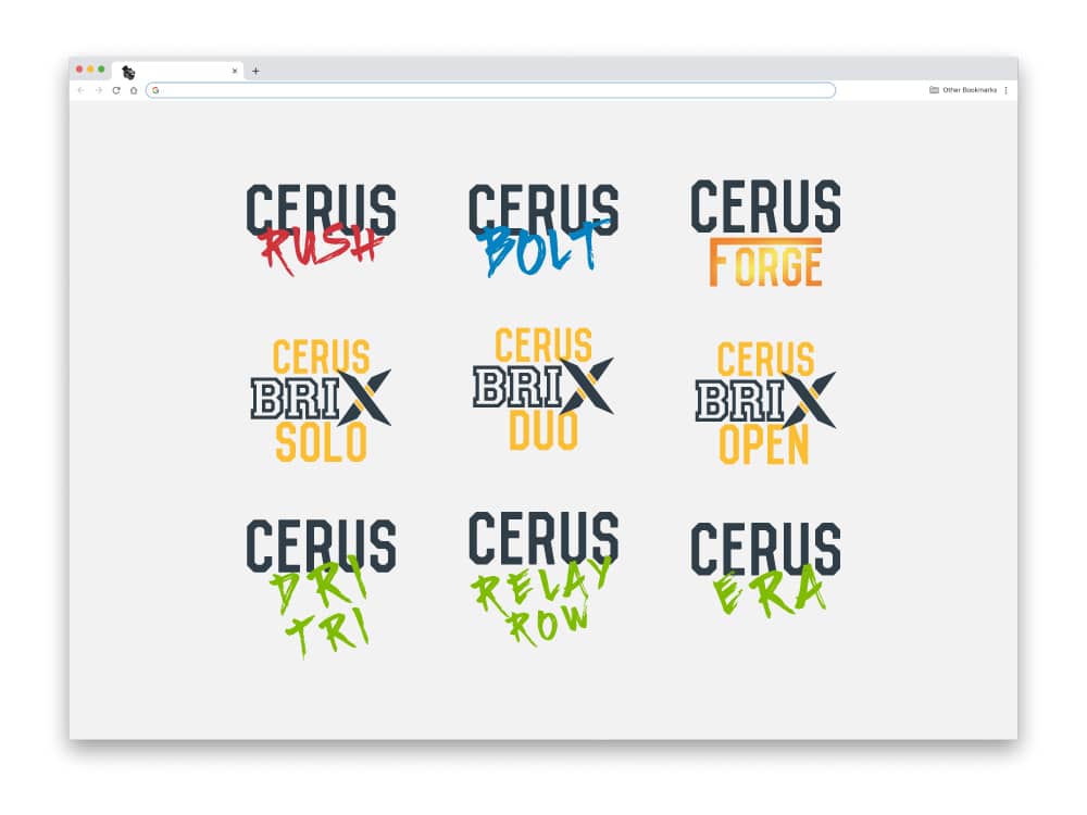
With the umbrella brand developed, we were able to expand the brand into a library of sub-brand assets for each obstacle race and endurance event. The idea was that upon completion of a race series, the medals won could be assembled together, joining into a massive multidisciplinary series crest. See below for details.
FORCES COMBINED
What started out as a few handmade hurdles and climbing walls, turned into state wide race series with dozens of different events and on any given weekend, hundreds of smiling, sweating, participants, all wearing CERUS gear from head to toe.

ONE WEBSITE TO RULE THEM ALL
GYM INFO, CLASS SCHEDULE, LEAD CAPTURE, EVENTS HQ, AND TEAM MEMBER PAGE JUST FOR STARTERS
–
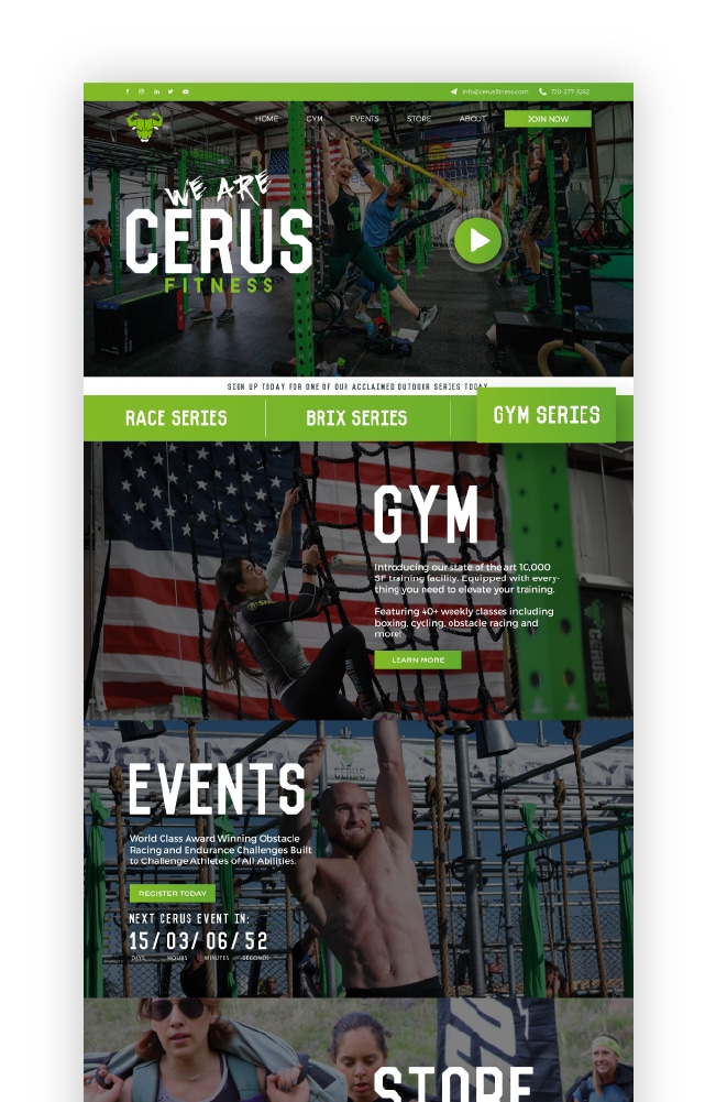
The website was going to be a monster. It had to effectively support an already HUGE real world following, while also providing information about the gym itself, class schedules, event and race info, the ever growing CERUS team and pricing, all the while allowing for quick & easy contact, lead capture and aesthetically reflecting the strong and vibrant brand developed on the ground from the ongoing events and races. We had our work cut out for us, but Chris’ ambition and devotion to the community he’d already developed gave us plenty of motivation.
The website’s style needed to be bright and bold, with plenty of interactions and engaging modules. Each event series needed not only its own page, but its own branding scheme. That attention to detail, and brand compartmentalization, was critical, as people familiar with the “Race Series” brand, for example, may not be as familiar with the “BRIX Series” brand, and vice versa. Designing each event page and sub-page to reflect the experience a participant has in that particular event, connects their experience from the race to their experience on the site. From the dirt to the digital and back again.
THE RESULTS
A brand new website, successfully launched
After several months getting our bulls in a row, the website was up and running. And in a few more months the overwhelming traffic coming in to the site was proof enough that the project was a success. The efforts made on the ground now had an effective and convenient digital support system that would help the company continue to grow and develop.
Thanks again to Chris and his amazing team for all their help through the process.
